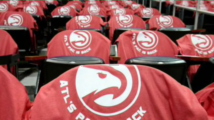
Atlanta Hawks reveal new secondary logo (Photo)
By Josh Hill

The Atlanta Hawks are a playoff surprise this year as not only did they shockingly make it into the postseason but they are a game away from bouncing the No. 1 seeded Indiana Pacers. So, with all the hype surrounding the team, the Hawks chose now as the time they want to revel their new logo to the world.
According to a press release from the team, the new logo will officially debut later this summer in the team store and will give the otherwise bland secondary logo for the Hawks a little more bite.
Last night saw the team give a ‘sneak peak’ at the new logo as it appeared on shirts that were given out to fans attending the game. Basically, it’s the same alternate logo that the Hawks have always used except there it’s supposed to now look like an angry Hawk and not one that just flew into a window.
While fans have gotten used to the old Buster Keaton deadpan expression logo the team has used, the new logo goes an otherwise bland logo a bit more personality. Still, the secondary logo isn’t all that impressive to begin with but at least it looks a little cooler than it used to.
[h/t: Paul Lukas, UniWatch]