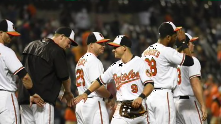
MLB: Power ranking the best uniforms for 2015
By Will Osgood

18. Colorado Rockies
Like Tampa Bay, the Colorado Rockies have multiple alternate tops, and for some reason I don’t hate it. The purple alternates leave something to be desired, and the black alternates aren’t outstanding. But they seem to fit the Rockies.
Each uniform uniquely fits the urban, but outdoorsy, dichotomy of Coors Field. So, too, does the regular home white with the black pinstripes and black lettering and numbering-with just the slightest hint of purple shading.
The colors really work perfectly, and again, they identify so well with the ballpark the Rockies play in–Coors Field uses rustic architecture so perfectly in the urban downtown setting.
The uniforms, though not exactly original, and not tremendously different from the ones they debuted in 1995, present one of the best fits to the ballpark of any team.
That isn’t necessarily a prerequisite, but it certainly doesn’t hurt. It’s a nice coincidence, or if not a coincidence, a nice symmetry which is fairly unique. So kudos to Rockies management. At least they’ve gotten one thing right.
Still, a few years back they had a home alternate uniform with the “CR” logo, which mirrored the look on both the home and away caps, on the chest plate of the jersey.
Again, I do like alternate home whites–or grays–if done well. In my opinion, those were done properly. Maybe they don’t need to bring them back, but if they chose to, I certainly wouldn’t dock them any points in my super important rankings.
Next: Another team who has stuck with it