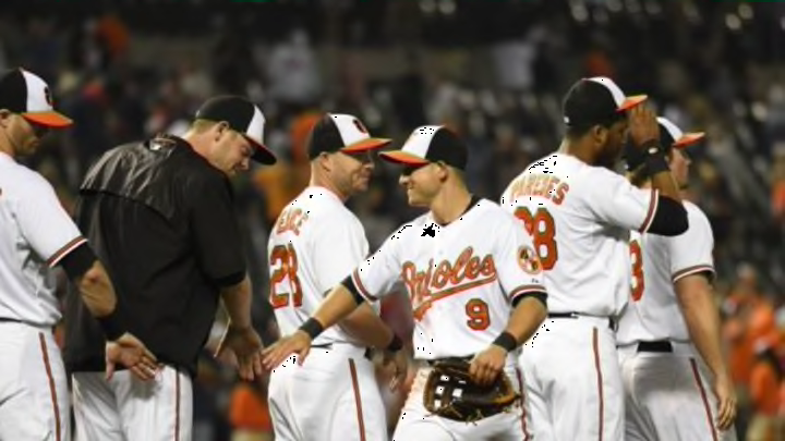
MLB: Power ranking the best uniforms for 2015
By Will Osgood

24. New York Mets
It’s hard to hate on the New York Mets’ threads. And I don’t hate them. Not at all. This is the line where we get to teams being the victim of everyone else having solid uniforms.
The problem with the Mets is this: While it is a classic look (generally a good thing), these were never very good in the first place. I mean they are not terrible. I like orange (as you’ll see). And I like the way the Mets’ combination blends the blue with orange. It’s actually a great look.
The main issue comes with the orange bill they’ll wear on their caps when they wear the alternate blue tops at home (as shown above). Again, it’s not a bad look. It just seems like they’re trying a little too hard.
It seems, as if by adding the orange bill to the caps, they’re trying to be something they’re not. Of course we all know teams debut additional hats and looks for memorabilia revenue purposes. The reality is the Mets’ blue bill is so classic, there is no reason for a fan to want the orange-billed cap.
It’s hard to write about the Mets’ uniform combination, because I like it. Having them at 24 seems like an indictment, when in reality it just shows they’re simply not as good as the other 23, in my opinion.
I also really liked when the Mets had two home white uniforms—one with stripes, one without. And even though not traditional, I liked the black alternate jerseys they had once upon a time.
Next: Brew Crew