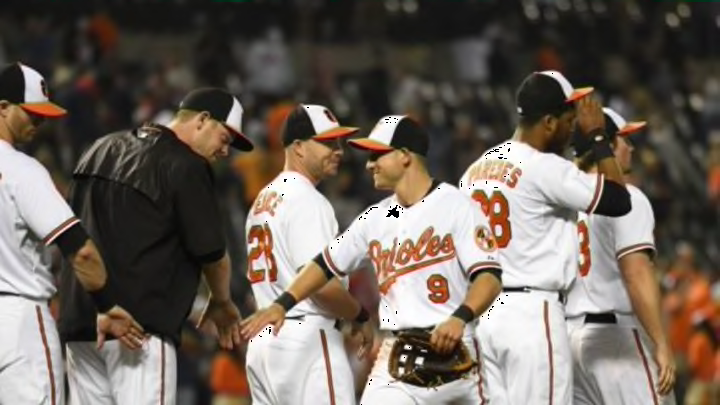
MLB: Power ranking the best uniforms for 2015
By Will Osgood

23. Milwaukee Brewers
Here’s another team I don’t hate. In fact, I actually love all the Brewers’ uniform tops and combinations–even the gold alternates they sport at home from time-to-time, of which I understand some are not as fond.
I’m not much for multiple alternates–especially alternate colored tops–but the Brewers’ dark blue and gold duo work well given the team’s name.
Everyone loves their throwback uniforms with the old light blue color and glove logo. I do too. I also like their regular uniform tops—Brewers spelled out in a nice cursive at home, Milwaukee away.
The dark alternates, and even the gold ones, are solid. It’s hard to say anything bad. Once again, this feels like an indictment.
Perhaps again, it’s the case of me being jaded about how often the pitchers elect to go with the alternates (of course that won’t stop me in ranking a few other teams much higher).
I especially love the way the Brewers’ logo and uniform integrates some of the idea of the team name, with a wheat/hops look. It works. It’s beautiful. But for some reason, they belong here.
Next: This team starts the range of could go either way