Ranking the 10 ugliest NFL uniforms of all time
By Stu White

7. Jacksonville’s New Uniforms
Poor Jacksonville. Picking on the Jaguars seems unfair, like being back on the elementary school playground and being kicked in the ribs even though you are already slurping mud out of the puddle behind the baseball backstop, your tears mixing with the grime, watering it down a little, adding a dash of saltiness and shame to every filthy gulp (uh, I mean making some other kid do that).
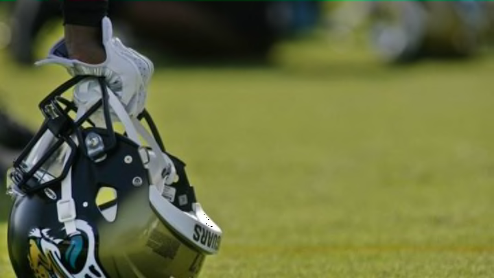
The Jaguars are a perennial laughingstock on the field, a bumbling and incompetent team that the NFL likes to send to play in London as a way to punish England for at one point daring to tax us without representation, so it seems a bit cruel to mock their ugly uniforms, but the sheer hideousness of that helmet is impossible to ignore. Sure, the teal-eyed jaguar logo looks cool, but that back half of the helmet is a crime against the color spectrum. What color is that, even? Glossy Ford Pinto gold? Take-your-baby-to-the-doctor-because-she-may-have-intestinal-problems brown? Whatever it is, it is unattractive and off-putting.
What is especially sad is that the Jaguars sported some pretty spiffy duds back during the Mark Brunell glory days. Seriously, take a look at these and compare ‘em to what the Jaguars wear now. In what world is that transition indicative of progress and improvement? The only plausible explanation is that the stadium snacks at EverBank Field are so unhealthy that the Jaguars are trying to induce vomiting in order to keep fans from suffering food poisoning. But beyond that, I have no clue.
Next: 6. Cleveland or traffic cone?