5 NFL teams that need to change their logos

2. Cincinnati Bengals
Realistically, there are only so many things you can do when your mascot is a tiger. Since ‘tigers’ is the second-most common team name in American sports, kudos to Paul Brown for deciding to switch it up a bit and name this franchise the ‘Bengals’ instead. Of course, bengal tigers aren’t exactly native to Ohio (thank heavens for that), but then again lions aren’t roaming around Michigan and there probably aren’t many buccaneer pirates commandeering yachts off the coast of Tampa.
Accepting the Bengals means accepting orange and black together outside of Halloween, and it also means accepting stripes. Count me in as a fan of the helmet design worn by Cincy players — it’s the most obvious choice for a team named after tigers, but that still doesn’t mean it’s a bad choice. There are actually a surprising number of teams named ‘Tigers’ in sports that actually don’t utilize black and orange stripes (LSU in college and Detroit in baseball are the first that come to mind).
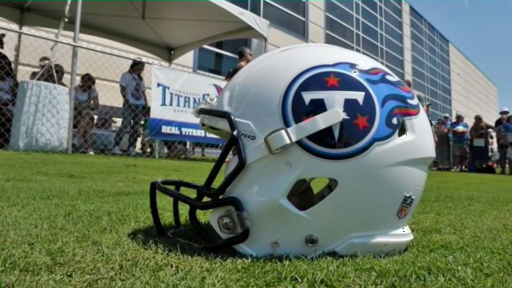
Where the branding starts to go off the tracks is with the official team logo — a giant letter ‘B’ filled in with those same orange and black stripes. The ‘B’ clearly stands for ‘Bengals,’ but as was the case with the Tennessee Titans and their letter ‘T,’ this logo leaves a lot to be desired creatively.
It’s all too easy to imagine the Cincinnati football brain trust locked in a boardroom somewhere years ago, tossing around different ideas unsuccessfully until finally someone just said, “Why don’t we just go with a big orange-and-black ‘B’ for ‘Bengals?’ That makes sense, right?” And rather than strive for anything with even a bit more pizzazz, originality, or flash, everyone just collectively shrugged their shoulders and replied, “Sure. Why not?”
The Bengals proved last season that they’re a better team that many give them credit for. Shouldn’t their logo do the same?
Next: 1. Los Angeles Rams