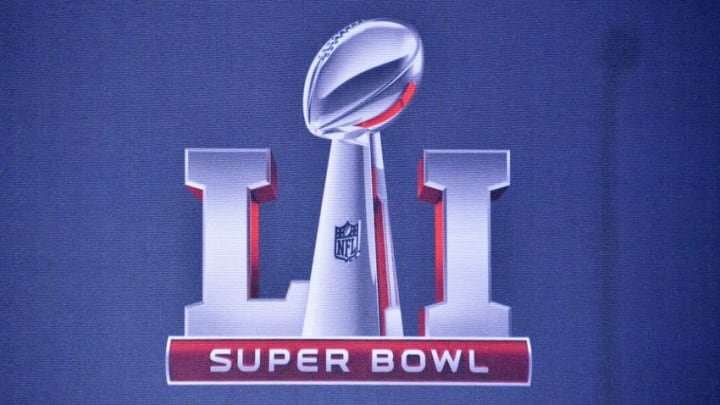
Super Bowl logos: Power ranking 30-1

8. Super Bowl XXXIII
Originally this logo looks to be for a game in Las Vegas, but we all know that isn’t going to happen, courtesy of Mark Davis. Like other logos this one captures some of the local flare for Miami. The reason Vegas is the first thing that comes to mind is because of the idea of it being a party or part of a theater marquee.
Of course, only Miami will rival a Vegas party, and the design represents that. I would have liked to see a little more blue or even a touch of red to recognize the AFC, but the logo does its job. Of course, the image of a marquee is fitting as John Elway walks into the sunset with another Super Bowl to his name.
7. Super Bowl XXXIX
Once again the Super Bowl logo taps into the local feel of the host city, Jacksonville. Fans see waves ripple across the ocean, and the prominent bridge suspended overtop. Having the sun instead of the bridge may have fared a bit better with the ocean scene, but regardless it works.
The word Super Bowl is nicely placed in the middle, while not being overmatched by the roman numerals or images embedded around it. I especially like the font the designer put the roman numerals in, and the shading is also a nice touch.