Super Bowl logos: Power ranking 30-1

22. Super Bowl X
Super Bowl X could have been promoted in so many ways, but I like the basic design the league went with. The unique font went on to be used several more times by the league for their Super Bowl logos, and it’s a very sleek design. Nothing fancy, just the game. It’s the Bill Belichick of Super Bowl logos; it does its job, while being just a hair different. Certainly nothing wrong with that, especially when it continues to win over and over again.
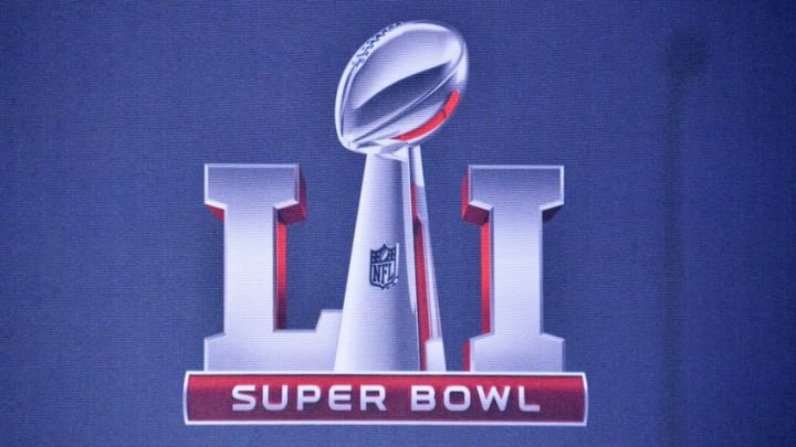
21. Super Bowl LI
This year’s logo finally makes an appearance after the NFL brought back the roman numerals. It was understandable why they avoided having “Super Bowl L” simply because of the mocking it was taking early on. Going back to the roman numerals was needed, and the league was smart to incorporate it.
Unlike logos in years past, this year does not include the home stadium or anything really related to the host city. I like the league and designer going in a different direction from the generic late-40’s Super Bowl logos. This year’s logo is very sleek with the red reflection off the bold numerals and the Lombardi trophy standing resolutely between them. Well done, NFL