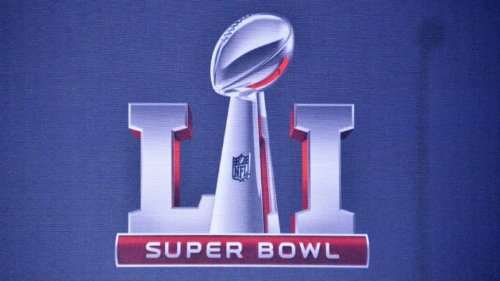
Super Bowl logos: Power ranking 30-1

18. Super Bowl VI
This logo for Super Bowl VI takes you back to the wild west, which is a coincidence since the Cowboys would win the big game. The curves and tails coming off each letter look like spurs, and the design as a whole looks like a free-swinging saloon door. It’s a very 1970’s approach but you have to love it.
As mentioned earlier, the Cowboys would ultimately come away with a victory led by Roger Staubach and coach Tom Landry against Don Shula’s Miami Dolphins. Dallas nearly shutout Shula’s Dolphins, winning 24-3 en route to the Cowboys’ first championship.
17. Super Bowl XXXI
You can not get any more “New Orleans” than this logo for Super Bowl XXXI. While I love the traditional three colors, I applaud the use of the purple, gold, and green as a tribute to the great city. Everything in New Orleans is the life of the party, and this design brings the party and spirit of the city to life. Looking like a court jester with the king’s crown, we are reminded that while the NFL is fun and exciting, it reigns supreme over all other sports and the Super Bowl does the same. It’s unique, but it works for the place and occasion.