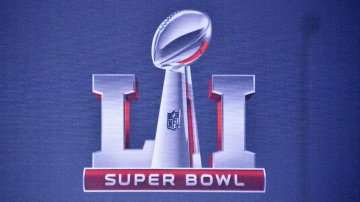
Super Bowl logos: Power ranking 30-1

14. Super Bowl XLIII
The logo for Super Bowl XLIII looks as if it is rising out of the field, and looks great doing so. The designer avoided using all the letter I’s as pylons, which is fine. One pylon is good, three is just too many. Having the red and blue stars one each side representing each conference is once again a good addition. This is also the first and only time the Super Bowl logo included a football field. Hard to believe, but whoever designed the logo with the NFL was smart to finally bring the field back into play.
13. Super Bowl V
Super Bowl V, also known as the Blunder Bowl thanks to 11 turnovers, brings a clean, simple design. With a balance of red, white, and blue the logo the crisp lines and smooth curves balance well. I would have liked to see the lines be a bit thicker, and something needs to be done with the “E” in Super. If the letter “L” is not one-hundred percent curves I am not sure why the “E” is not the same. It looks like someone took a bite out of the number eight.
Regardless, the logo is clean, simple, and a great representation for a game won in the final seconds thanks to a field goal.