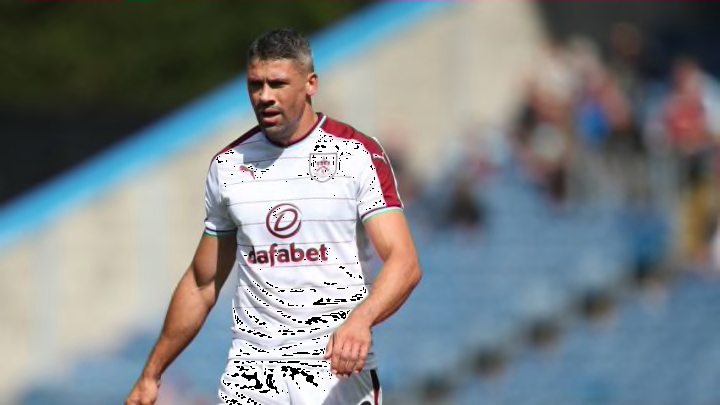
Premier League 2017-18 kit rankings
By Ty Finch

15. Huddersfield
I had a difficult time trying to rank Huddersfield. They are one of the few clubs that will be battling for relegation that also have three kits. Their alternate barely factors in their 15th-place rank, but it’s interesting to see a newly promoted club go all out with their jerseys.
READ about #htafc's new shirt sponsor OPE SPORTS as the online gaming company agrees a multi-year partnership https://t.co/PMZ4Tb2oU2 (DTS) pic.twitter.com/7cJg9NOgXR
— Huddersfield Town (@htafc) June 30, 2017
The home kits made me check to see if my eyes were still working properly. The white background and baby blue stripes themselves are fine, but the way those stripes dissolve into dots makes the whole kit look blurry. The single red button at the top also is rather unfortunate. What good does that do? It does not help the design, that’s for sure.
Huddersfield don’t actually have a set “away” kit, but two separate alternatives. The one that deserves all of the attention is their famous “electric hoops” design, worn in 1991.
#FLASHback! The #htafc players emerge onto the Gigg Lane pitch to reveal that the famous 'Electric Hoops' have returned for 2017/18! (DTS) pic.twitter.com/xNar69kIel
— Huddersfield Town (@htafc) July 16, 2017
I waiver back and forth on deciding whether I love or loathe this kit. It’s unlike any other jersey that will be worn this season, that’s for sure, but it also kind of looks like it has been ripped to shreds. Either that or there are sound waves coming out of the shirt.
There are many things that can be described as “so bad it’s good,” and I think this kit fits the bill. I love the retro nature of it, and can easily see it being worn in the early ’90s. My only problem is the sponsor being smack dab in the middle of the top “electric hoop.” It takes away some of the flow.
The other alternate is pictured on the far left. I’m not sure why they would ever wear it though, considering how wild the first is.