Power ranking all 30 MLB uniforms

1. Baltimore Orioles
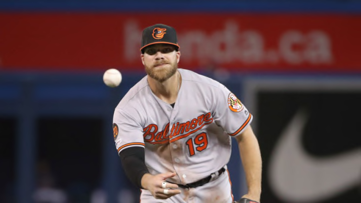
The Orioles are a difficult watch this season as they enter the first year of their total rebuild, but at least they look good while playing poorly. The City of Baltimore doesn’t have much to cheer about when it comes to the Orioles, but their uniforms are the best in the entire league. So there’s that.
Orioles management made the incredibly smart decision to abandon their more modern uniforms and go back to the franchise’s iconic cartoon bird logo. Ditching the anthropomorphic bird on the hat in favor of the smiling cartoon was perfect, and as an added bonus, the Orioles returned to relevance right as the change was being made. The current uniforms perfectly pay homage to the best years of the team without looking forced.
The hat is the best part of these uniforms, but the rest is top-notch as well. The orange script on the jersey has a special flare and matches the vintage air of Oriole Park at Camden Yards without looking forced. There is a crispness and sharpness to the cursive script on both the home and road jerseys.
Next. Top 25 MLB pennant races of all time. dark
Of course, the Orioles also feature the Maryland state flag on a sleeve patch, which is something every Marylander can be proud of. Having “Baltimore” on the chest of the road jerseys instead of “Orioles,” as it was from the 1970s to 2012 is another smart decision. Baltimore was originally removed in an effort to try and recruit fans from Washington, but with the Nationals encroaching on their turf, the Orioles are all in on Baltimore.