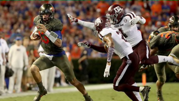
15 college football uniforms that are total fashion disasters (Photos)

1. Miami (OH) RedHawks 2013 Home/Away Uniform
Alright, all of you Power Five school fans can breathe now and be thankful that this team from the MAC took home the crown in our list of uniform disasters. I feel like this is a clear no brainer no be number one. The Miami Redhawks decided to rock this uniform in 2013 are now going to pay the price for doing so. (Went to Twitter for help with this one).
“@CardiacShook: ! ! RT @JeffAtFSOhio: The Miami (OH) uniforms. pic.twitter.com/GptL4Ukpc2"” @bethany_bruner
— . (@newarkurt) July 24, 2013
New uniforms, helmets and football decals for Miami (Oh) Football. @MiamiOH_Equipt @Uniformswag #MiamiRedHawks pic.twitter.com/x1GhalNsrs
— Healy Awards - The Nation's Toughest Helmet Decals (@HealyAwards) July 25, 2013
Let’s analyze this, shall we?
- It was designed by Adidas. So the jerseys look too tight and the numbers look like iron-ons.
- The helmet is chrome, which is tough to pull off unless you’re Louisville or Oregon. And then to have all those feathers on there just makes it look cluttered and makes you lose the “MIAMI” on the back of the helmet. And don’t forget about the “M” in the middle of the helmet.
- It’s okay if you cannot read the helmet, the RedHawks made sure to put those iron-ons to good use by outlining the word “MIAMI” from one shoulder to the next. And it’s a five-letter word, so they tried splitting the “A” in half to accomplish their goal.
- And to top it off, they took a page out of the Tennessee Titans playbook and went with a heavy stripe just on the top of the shoulders and sleeves. What this does, besides creating an illusion of what color this jersey actually is, is beyond reasonable thought.
Easy way to fix this: switch to Nike. Kidding. But really, get rid of the stripe and “MIAMI” on the jersey and take the feathers on the helmet and condense them in Miami (OH)’s “M” and that would look normal. But from the chrome helmet to the iron-ons to the splitting of the “A”, this uniform is more than terrible and earns the first-place finish atop the podium as the most disastrous uniform in college football.
So what do you think? Did we miss any? Were we too harsh on those who did make the list? Let us know! And maybe Fall 2020, or Spring 2021, will provide us some more beautiful disasters we can put on this list.
dark. Next. 50 best college football uniforms
For more NCAA football news, analysis, opinion and unique coverage by FanSided, including Heisman Trophy and College Football Playoff rankings, be sure to bookmark these pages.