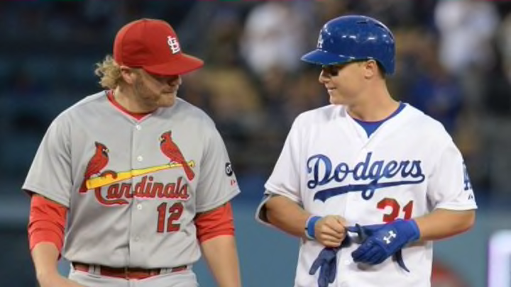
MLB: Major League Baseball uniform power rankings

player. 82. . Est. 1993. National League East. Miami Marlins. 30
- Home Cap: 29th
- Home Jersey: 30th
- Road Cap: 30th
- Road Jersey: 30th
The Good: I don’t mind the Marlins embracing the flashy style of Miami with bright accent colors like the new orange, yellow and blue hues the team incorporated in its rebranding prior to the 2012 season. In fact, I really like it when a team emphasizes the uniqueness of its host city. However, there is a lot of room for improvement with the team’s current uniform set.
The Bad: There are very few bad uniforms in Major League Baseball today, especially among the traditional home whites and road grays. However, the Miami Marlins failed in a couple of key areas when rebranding a few years ago.
The new M logo, which was a major shift that coincided with renaming the club the Miami Marlins after nearly 20 years as the Florida Marlins, is one of the worst in the Major Leagues. It just doesn’t look like a baseball logo should. There are too many sharp edges or something – I can’t quite put my finger on exactly what bothers me so much, but something is off. Also, the numbers the team uses are cartoonish – too round and bubbly – and unsophisticated.
Miami’s team colors are good and with a different M logo and better numbers, the Marlins might climb a little higher in our rankings. But as it stands, they have to come in 30th out of the 30 Major League Baseball teams.
Next: 29. Texas Rangers