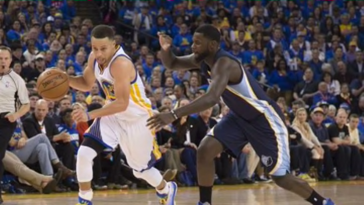
Understanding offense at the team level is complicated. There are five players (theoretically) working together, each with different skills and responsibilities. Then there is the defense, itself offering variables in skill, design, and execution. As such it can be easy to confuse process with results, intent with production. Last year, I did some work here at Nylon Calculus trying to separate out some of the macro elements of offensive style. I looked at each team’s offense across four characteristics — pace, shot selection, ball movement and player movement. By focusing on just these elements we were able to see a somewhat clearer picture of how each team goes about trying to accomplish the task of getting the ball in the basket.
I’m happy today, although a little late, to be able to share final offensive style charts for the 2015-16 season. You can also compare each team’s offensive style from this season to last season. If you’re not interested in the explanation of how the measures used to build these graphs, feel free to skip ahead a few paragraphs and just enjoy the visuals.
I tried to use as accurate a measure as possible for each style characteristic and I’ve adjusted slightly from last year. Ball movement is measured with the average touch time for each team, from the NBA’s player tracking statistics. A lower average touch time means the ball is moving from player to player more. I’m using a new measure for player movement this year, also from the player tracking statistics. It combines offensive distance traveled and time of possession to arrive at average distance traveled per 24 seconds of possession. For pace, I’m using the average length of an offensive possession from Inpredictable, a more accurate representation for how quickly a team is working than traditional pace.
Shot selection is the one small hole in the process this year. I am using Seth Partnow’s XeFG% which estimates what a team’s effective field goal percentage should be given the location of their shots, the mix of catch-and-shoot and pull-ups, and how close the nearest defender was. However, those stats were built on the player tracking shot logs which stopped being publicly available on January 25th. As such, the shot selection measure on the graphs only covers a team’s shot selection through that date, which is a little more than half the season. We may be able to build a less accurate but still suitable measure on the future, but for now this seemed like the best available.
On the graphs below you’ll see a line for this season and last season. As the line moves away from the center of the graph one each axis you’re seeing more of that stylistic trait. Shot selection shows an more efficient shot selection, in the abstract, the further you are from center. For example, the Golden State Warriors are on the extreme end for all four measures.
As tempting as it is to look at the Golden State Warriors and assume their style represents some sort of perfect ideal, it’s important to remember that no particular style appears to have a definitive claim on efficiency. For example, the graph below shows the five-most efficient offenses this season and you’ll see that there are no obvious traits that connect all of them.

Please enjoy the team graphs above, feel free to share, and ask questions. I should have some more analysis coming with these graphs over the next few days.
