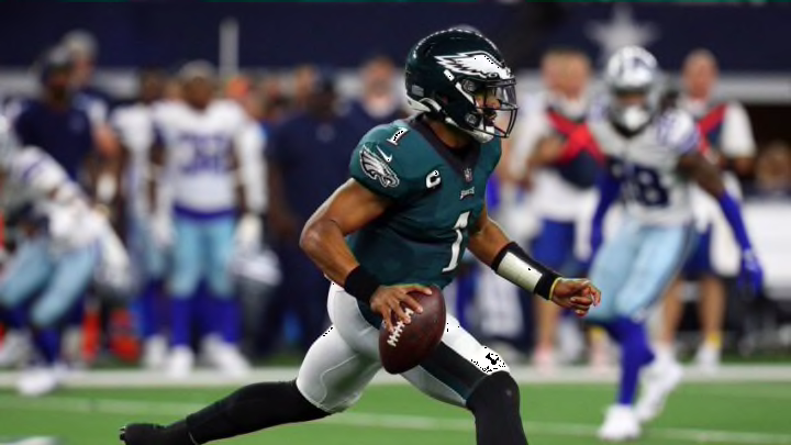
The Philadelphia Eagles decided a rebrand was necessary, rather than improving their football team. Unfortunately, it looks far too corporate for our liking.
Philadelphia didn’t really need a rebrand. If anything, we were happy to see the team bring back their Kelley green jerseys of old.
Yet, that’s wasn’t enough for these Eagles.
The front office and creative department teamed up to redo their logo, or at the very least test out a new brand technique. It looks…incredibly boring, like something a business major would come up with.
The #Eagles have tweaked the wordmark for their logo, going with a more modern look. pic.twitter.com/raqORA9dvm
— Ari Meirov (@MySportsUpdate) June 16, 2022
This is a font I could have drawn myself, which is not a compliment in any way, shape or form. I am a terrible artist.
The previous Eagles logo, as you can see in the tweet above, is not perfect by any means. Did it need a rebrand, though? No. At least it’s somewhat unique, and in many ways bird-like. Basic all caps text that reads EAGLES offers next to no personality.
Eagles logo rebrand needs some work
‘Modern’ is not always a good thing. Modern can be boring. This is boring.
Philly doesn’t need a new brand as much as it needs a better on-field product. A new logo is not going to distract from a second-place NFC East finish.
Jalen Hurts is fine. The receiving corps is improving, as is the (hopefully) defense. But Philly sports fans aren’t the most patient in the world.
finally watched Hustle and how is this not a meme yet pic.twitter.com/vQJGS6hGvK
— Devan Kaney (@Devan_Kaney) June 15, 2022
Branding opportunities can only distract from the truth for so long. A Coldplay remix won’t do much, either.
