Last Thursday, the Tampa Bay Buccaneers debuted their new logo and helmet for the 2014 season – one that was a bit of a disappointment given everything we had heard.
Sure, it was nice, but the changes were somewhat subtle outside of the fact that the new logo will be huge on the helmet.
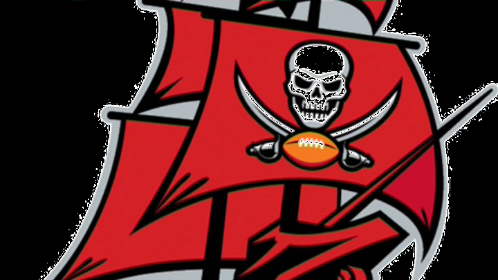
But the change that is seemingly getting the most attention is the Buccaneers new alternate logo which is a modified version of their former pirate ship logo.
It’s not a complete overhaul (from a technical standpoint) but it certainly looks like it given the changes.
The former logo looked more to be an outline or silhouette of a pirate ship with a bit of red coloring in it to give it shading. The new pirate ship logo though is much more three dimensional and looks to be a true logo outside of the previous ship which wasn’t used all that much.
As of right now there’s no word on if the new logo will be used on the uniforms in any capacity – though I have to imagine it would look great on an alternate uniform/helmet.
Old:

New:

