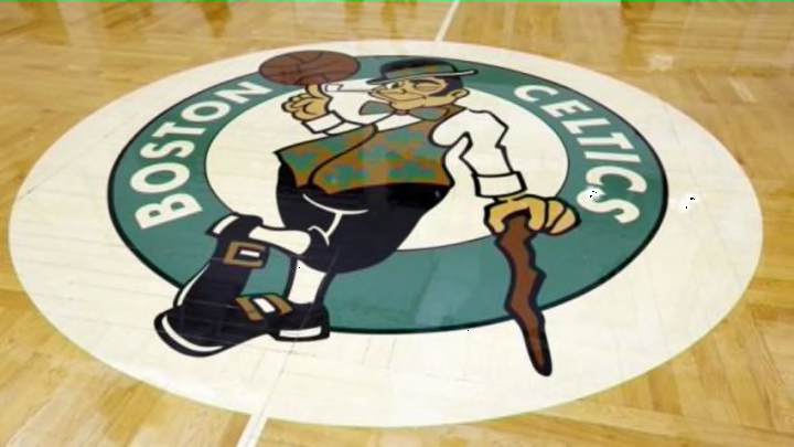
As the NBA plays around with their uniforms, moving the league logo and considering adding gold championship tabs, the Boston Celtics are doing a littler altering of their own.
The Celtics are going to debut a new alternate logo.
From the Boston Globe:
"Created in-house, the logo, which is known as the “Lucky Alternate,” pays homage to the early 1960s illustration created by Celtics patriarch Red Auerbach’s brother, Zang, a former editorial and sports artist for newspapers in Washington.It features the classic image of Lucky the leprechaun spinning the ball on his finger, only in white silhouette against a green backdrop, encircled by the words “BOSTON” and “CELTICS” in white."
It is really simple and elegant, nothing out of the ordinary or a more modernized version of the cartoon. The logo won’t appear on uniforms, instead it can be found on team apparel and merchandise on sale through the team’s online store. Makes you wonder if it is received well if it will work its way onto alternate unigorms, but it won’t be replacing the old logo.
“We think of it more as extending the Celtics brand,” Keith Sliney, the Celtics’ creative director and the logo’s designer, said. “Our existing logos are not changing. This alternate is an additional emblem for us to use on everything from print to web to fabric. It’s very flexible.”
Check it out below.
