

Two sets of designers have set out to revamp NHL logos with a bit of minimalism. Designer S. Preston has had his work noticed before. His style is to isolate a feature and zoom in on it. You can really see that in the minimalist MLB ballpark posters he did. The Tampa Bay Rays he focused on the fish tank, for the Pittsburgh Pirates he focused on the bridge, for the St. Louis Cardinals he focused on the Arch in the grass.
You get it right?
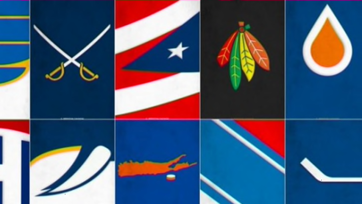
So here is a collection of his 10 best logos, selected by Deadspin:

S. Preston also has all 30 teams logos available for download if you like them.
The zoomed in logo doesn’t work as well as the ballpark posters, in my opinion. I do like the idea of simpler logos. I’ve always been one to appreciate simple or classic logos and uniforms. I’ve never been a fan of the enhanced modern logos with lots of levels and things going on. Simple is better in my opinion.
These logos from Segments Design below get the job done better in my opinion. I don’t necessarily think that all his logos are better, but I liked the zoomed out approach a little bit better.
For instance, I prefer S. Preston’s Islanders and Blackhawks logos to Segments Design‘s. What do you think? let us know in the comments below.
