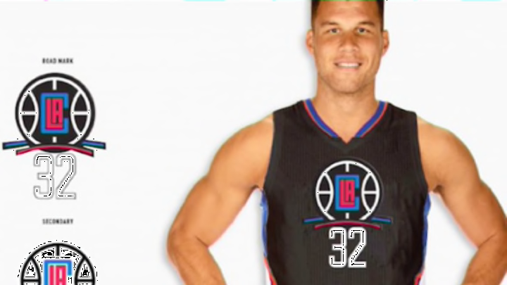
The Los Angeles Clippers have been rumored to move away from their classic logo scheme, but are these really what we’re going to be dealing with?
When Steve Ballmler purchased the Los Angeles Clippers this past summer, it was rumored that the team was going to be moving away from the logo and the uniforms they’ve been using for years. Much of this had to do with the stained image that previous owner Donald Sterling left when he burped up all over his brand with his bitter racism.
That’s an era in the past though, but it’s still an era that the franchise is trying to move as far away from as possible. the rumored facelift that the franchise was supposed to get when Ballmer bought the franchise could be coming for the 2015-16 season — but maybe not all change is good.
There’s no doubting that the Clippers could use an updated look that distances themselves from the ugly era of Donald Sterling, but the new rumored uniforms and logos that were released leave a lot to be desired.
Here’s a look at what the Clippers new logo will supposedly be — and prepare for your eyes to bleed.


Oh wow.

Look, it’s not the worst thing we’ve ever seen but it’s pretty damn close. There’s opening the Ark of the Covenant and having your face melt off and then there’s these — things — that the Clippers are supposedly going to wear moving forward.
1. That Logo Is Just Confusing
The new logo for the Los Angeles Clippers is supposed to be the birth of a triumphant new era for the Clippers but this is about as turd-ish as you can get. First of all, if it’s supposed to reinforce the ‘LAC’ brand it fails in just about every way humanly possible. If we read it the way it’s laid out, it’s not ‘LAC” it’s CLA’, which sounds like the Clippers are trying to take over the transit system in LA and not the league they play in.
More from Los Angeles Clippers
- Did Russell Westbrook play role in James Harden’s Clippers interest?
- 3 potential James Harden suitors not named the Clippers
- The new NBA flopping rules explained
- 5 players Sixers could acquire in Harden deal to stay competitive
- NBA rumors: One Damian Lillard suitor could drop out in favor of another star
It’s an inspired logo, and there needs to be credit given to the fact that this is pretty far away from what the Clippers have had. But there’s a right way to make a new logo and a wrong one, and this is an example of the latter — so hard.
2. These Look Like All-Star Game Reject Uniforms
All-Star uniforms are the biggest cash grab in sports, as they’re relevant for literally a weekend and then they head straight to the discount rack of every retailer. The reason they’re so irrelevant isn’t because they’re used for just one game and then discarded, it’s because they’re usually eye sores that are simply experimental marking for the NBA.
Whoever got the brilliant idea to take the All-Star jersey concept and apply it to the Clippers uniforms needs to be banished north of the wall and fed to the White Walkers. Even if these are just Summer League jerseys, this is on the low end of that scale — and it’s hard to miss with the loose fashion rules that the Summer League plays by.
3. Black Jerseys Are Supposed To Look Cool
There’s underlying concerns about moving away from a racist owner by making your uniforms black to ‘inject youth’, but let’s not get hung up in that string of webs. That’s giving whoever created these abominations way too much credit on a deep philosophical level that isn’t warranted.
Instead, these jerseys take the one concept that exists in fashion and royally f-cks is all up. Black is cool, it’s always been cool and always will be cool — unless it’s on these jerseys. First of all, the Clippers colors in no way allow black to be incorporated, at least not like this. It’s not impossible to work black into a color scheme, as the Warriors and Timberwolves have been able to do that, as well as the Bulls. But this is just awful, as it takes a lot to make black not work in a color scheme but the Clipper have somehow done exactly that.
More from FanSided
- Joe Burrow owes Justin Herbert a thank you note after new contract
- Chiefs gamble at wide receiver could already be biting them back
- Braves-Red Sox start time: Braves rain delay in Boston on July 25
- Yankees: Aaron Boone gives optimistic return date for Aaron Judge
- MLB Rumors: Yankees-Phillies trade showdown, Mariners swoop, India goes to Seattle
