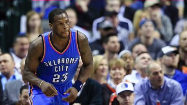
According to a report, Nike wants the Oklahoma City Thunder to update their logo from the shield that they currently use.
Next: Ranking The Best NBA Uniforms Of All-Time
The Oklahoma City Thunder’s vague logo might be not around for much longer. With Nike taking over as the NBA’s apparel provider in 2017, it is expected to revamp jerseys and insignias much like they did when they took over as the apparel provider for the NFL.
According to Zach Lowe of Grantland, Nike has set its sights on overhauling the look of the Oklahoma City Thunder.
"Nike will push for an overhaul once it replaces Adidas as the league’s apparel partner in 2017. Nike and the Thunder are already talking, and the Thunder “haven’t ruled out” a more explicit weather-related secondary mark, (Thunder vice-president for sales and marketing Brian Byrnes) says.Bad news: Oklahoma City seems locked into the shield motif and likely won’t replace it with a bison – or anything else. “To some extent, we are committed to the idea we have,” Byrnes says. “But we would not dismiss good feedback, particularly from Nike. We’re open to modernizing the logo, but we don’t have an appetite to overhaul it.”"
While Oklahoma City seems hesitant to the change, money talks and Nike holds the power when it comes to that front. Let’s be honest, the Thunder’s current shield logo does nothing for the team and gives nothing to the Thunder name except for the two tiny lightning bolts in the background.
It’s not the worst but is one of the more boring logos in the NBA. What about it exemplifies the name Thunder let alone the spirit of Oklahoma? Absolutely nothing at all. What’s even worse, is that they have a cool bison, which Lowe points out, for a mascot and have done nothing to build on that.
With the talent of their roster and the potential for logos, the Oklahoma City brand could be so much more. Think of the Chicago Bulls and how much brand initiative they get from the mean looking bull. Imagine a stoic bison charging in the distance with thunderous activity behind him.
There are so many possibilities for OKC, but instead it continues to rock the orange and blue shield. That’s fine, but the Thunder are a new franchise and shouldn’t be aiming for a classic look like some of the league’s original clubs. They need to roll with something edgy and modern. Something the kids can wear on a snapback hat and allow brand awareness to go through the roof.
Sure, they’re a top team and everyone knows the shield, but that doesn’t mean it’s a good logo. It sounds like if Nike has its way, the current logo will thankfully be no more.
More from FanSided
- Joe Burrow owes Justin Herbert a thank you note after new contract
- Chiefs gamble at wide receiver could already be biting them back
- Braves-Red Sox start time: Braves rain delay in Boston on July 25
- Yankees: Aaron Boone gives optimistic return date for Aaron Judge
- MLB Rumors: Yankees-Phillies trade showdown, Mariners swoop, India goes to Seattle
