2. Super Bowl XXXVI
For more ways than one, Super Bowl XXXVI was a monumental event in not just the history of the NFL but for the United States. Played four months after the September 11th attacks in New York City, Virginia, and Pennsylvania rocked the country, football was there to help heal. The league scrapped the original Super Bowl XXXVI logo in the wake of the attack and had the above image created. No longer was the game about the Patriots, Rams, or even football in general. It was about healing a country in pain.

1. Super Bowl 50
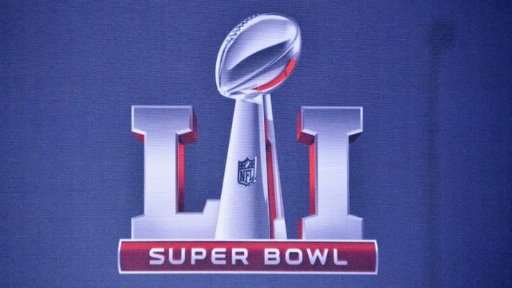
Out with the old, and finally in with the new! After the bland image of the Lombardi trophy squished together with roman numerals and a gray stadium was used for years, the NFL went all out for their golden anniversary. Having the golden 50 instead of the simple roman numeral “L” was a smart marketing ploy.
Having the Golden Gate Bridge silhouette was a subtle but game-changing touch added by the designer. Hopefully, this logo sets a new precedent for the game going forward. Adding a color other than gray/silver should be a new requirement for the logo going forward. Bringing back the local flavor through the colors wouldn’t hurt at all.
