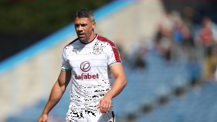
Premier League clubs make changes to their kits every year. Here are the rankings of every new kit in the 2017-18 season.
Much ado is made about new Premier League kits every season. Fans gladly shell out hundreds of dollars for shirts that have slightly darker shades of color or a stripe that goes horizontal instead of vertical. Inevitably, some of these kits are bound to be serious eyesores, while others are crisp and sharp.
Nobody will ever confuse me with a fashion expert. I prioritize comfort over style whenever possible, and own far more athletic shorts and sweatshirts than button-downs and slacks. However, it doesn’t take a trained eye to see a hideous design pattern or an overly busy shirt. In the same sense, even a fashion amateur like myself easily spots a clean, stylish kit.
Taste is obviously subjective, but I think we could all agree that Nirvana was objectively a better band than, say, Nickelback. At least I hope we all could agree on that. Right? Nevermind. I have All the Right Reasons for each and every Premier League kit ranking below.

20. Watford
Watford will have a hard time ever being high up in any kit ranking for me. The bumblebee yellow color is simply too much to handle, and the red collar and stripes clash with the rest of the shirt. I do enjoy the simplistic nature of the shirt and shorts, though. Anything more than the classic three-striped Adidas design on the side would prove to be far too busy.
https://twitter.com/WatfordFC/status/874945273830756352?ref_src=twsrc%5Etfw&ref_url=http%3A%2F%2Fwww.goal.com%2Fen-gb%2Fnews%2F2896%2Fpremier-league%2F2017%2F07%2F31%2F35869272%2Fpremier-league-kits-man-utd-arsenal-all-the-new-jerseys-for-2017-
Now, this home kit isn’t the worst in the Premier League by any means, but it certainly wouldn’t inspire me to purchase it. The real travesty are Watford’s aways, which prove that a simple design can also be hideous.
https://twitter.com/WatfordFC/status/882977754114904064
Even Tom Cleverley appears to be wondering what Adidas were thinking with that monstrous black stripe four-fifths of the way down the shirt. See how confused he looks? It completely ruins any sort of flow that the top had initially, and almost looks like an optical illusion. Maybe Watford are hoping for new technology to come along that has rolling advertising on the gargantuan black stripe like the boards on the side of the pitch. That’s really the only explanation I can think of.
The Adidas designers must have been re-watching the fifth season of 30 Rock recently. In episode 13, Kenneth Parcell pitches an idea to his boss about a bar at the bottom of the television to hide anything dirty that may be shown. A silly idea, of course, but one that Adidas thought brilliant for a new top.
The rest of the kit is relatively bland, which contributes to the worst ranking. But I simply cannot get over that stripe.
