
")
 fights for the ball with Chelsea Defender Gary Cahill (L) during the International Champions Cup 2017 match between FC Internazionale and Chelsea FC on July 29, 2017 in Singapore. (Photo by Power Sport Images/Getty Images)")
3. Chelsea
The Blues can’t always come in first. Chelsea will be sporting yet another Nike creation that looks similar to both Manchester City’s and Tottenham’s, with the main differences being the colors. It’s particularly tough to rank kits that look nearly identical, especially when they’re also as fresh as these Nikes are.
https://www.instagram.com/p/BWDVWdzFhdG/
The chaos in the background seems to compliment the neatness of the actual home kits quite well. Chelsea made the switch from Adidas to Nike this season, and the results speak for themselves. The previous home kit worn in last year’s title-winning run had undersized Premier League logos pasted in a pattern across the front of the shirt, which was a strange decision to say the least. They took attention away from the rest of the kit, and almost looked like a shadowy bedazzled addition.
Chelsea stuck with the same dark blue color they have used for years. The only other color used is the white wording and logos. There is also slight, knitted detail pattern on the shoulder area that’s nearly impossible to see unless you have a trained eye to spot such intricacies.
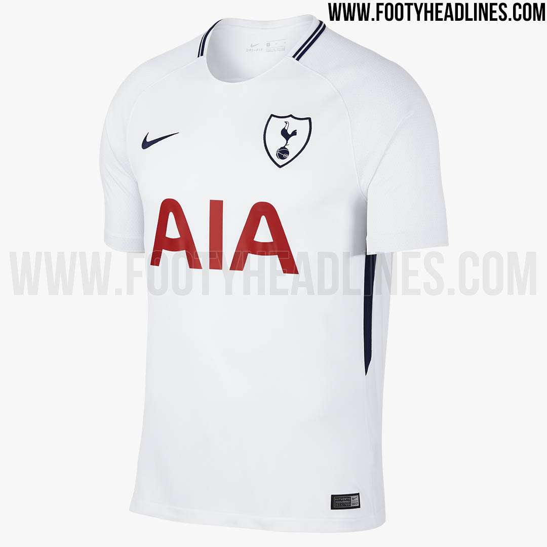
Both the away and alternate are also the same template as the previous Nike kits. Beside a slightly darker color in Chelsea’s away, they are identical to Tottenham’s home uniform. Check these pictures out side by side and tell me if you can see any difference besides a stripe on the inside of Chelsea’s.
If Nike’s kits were even slightly less eye-catching than they are, all three clubs that used the same design template would be ranked far lower. Instead, Nike bagged a hat-trick, even if all three were tap-ins.