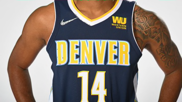
This season the NBA began a new apparel partnership with Nike, which means every team is being outfitted with new uniforms. Some have been tweaked more than others but from the ones that have been released so far, there appear to be some commonalities — clean, simplistic designs, similar lettering, etc.
To get a perspective on the new uniforms as a group, I spoke with Todd Radom, an independent graphic designer specializing in branding for professional sports franchises and events. Among the leading designers in the professional sports industry, he has worked for two decades with the NFL, NBA, and Major League Baseball. Most recently, Radom helped design the uniforms and branding for the BIG3 league.
The Step Back: In looking at the recently redesigned NBA Nike uniforms, have you noticed any common design elements or themes and, if so, what would be the purpose of those elements from an aesthetic standpoint?
Todd Radom: Function seems to have won out over form when it comes to trim details around jersey shoulders — many are abruptly truncated or tapered. We’ve also seen a concerted emphasis on logos that have placed on waistbands of shorts.
TSB: What’s the significance of the logos on the shorts? Obviously we’ve long since moved away from some of the more cartoonish logos and letting of the 1990s, but it seems like the new uniforms this year are going more clean and austere? Is that a throwback to simpler uniforms of earlier eras?
Radom: I’d say that it’s a way to further extend team branding and, in some cases, to utilize secondary logos in a visible way.
We have been “devolving” for a long time now. In the case of the NBA it’s sometimes been extreme and has often been almost too clean, with many teams looking quite similar at first glance. Look at Brooklyn, Toronto, Milwaukee — all radially arched, sans-serif wordmarks, with little embellishment. Not to say that any or all are bad, but they do look somewhat similar.
This trend toward greater simplicity has been a thing for at least a decade.
TSB Would you connect that trend to anything going on in the larger world of design and aesthetics? This may be a reach but it certainly seems like simple and clean are the dominant aesthetics right now for web design, interior design, even the visual look of dishes in high-end restaurants.
Radom: Everything has gotten less busy-looking, you are correct. Look at the icons and interface of apps, for instance. We went from hyper-gradated skeuomorphic to flat several years ago, and I believe that this translates to our sports identities as well.
My first pro team identity was done in 1993 — a different world. Designers were embracing new technology which allowed for more outlines, more colors, more of everything. The trend peaked at the turn of the millennium.
TSB: In your opinion what are some of the best of the new uniform designs? What are the elements you really like on those?
Radom: Of the totally new ones, I give a thumbs up to Indiana. Something different, but not ridiculously so, and it replaces a bland look that sorely needed an upgrade.
The Pacers have a great color palette, it’s been there for 50 years, dating back to year one of the ABA. (Also the Indiana state flag.) These uniforms show it off well. The most obvious diversion from convention is the team name in a circle. It could have been really gimmicky, but it’s clean and simple, and the side trim pattern draws your eyes right to the player number, a nice visual trick.
TSB: Is there anything you’ve seen in the new redesigns that feels like a completely new design element? Anything we really haven’t seen before in NBA uniforms?
Radom: I don’t think so. So much of what we’ve seen are tweaks, stuff that’s incidental at best.
Some of the more substantial changes seem lateral — the Spurs, for instance. Much of the rollout is cloaked in brandspeak and marketing jargon, which is not unexpected.
TSB: Earlier on, you mentioned some function tweaks around tapered trim and things like that. How much variation is there between the different teams in terms of cut and fit, things that might actually affect comfort, as opposed to just branding and looks?
Radom: I can’t really answer because I have not seen them in person or in action-but a glance at the Nike template and a read through their narrative indicates a focus on their proprietary cut.
Next: Redrafting the 2017 NBA Draft after free agency and Summer League
TSB: But every team has the same cut? Or does it differ from team to team?
Radom: Nike has their own “chassis,” a totally differently constructed and engineered garment than what Adidas had. The templated part may not be visually evident, but it’s there. Nike seems to have retained some necklines from last season and tweaked or discarded others.
