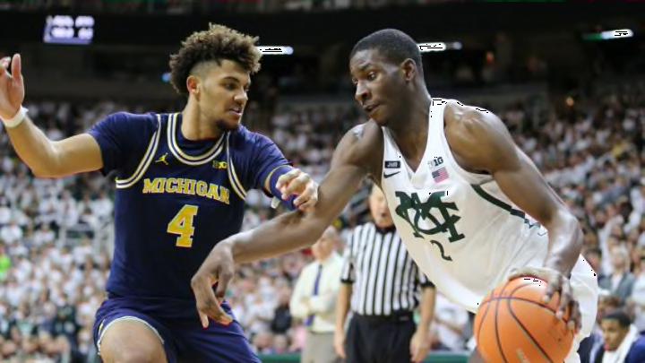
I genuinely cannot make this decision on my own.
The first half of the Michigan at Michigan State men’s basketball game Saturday morning was marked by an obscene number of fouls and Jaren Jackson, Jr. being Jaren Jackson, Jr. I, however, was deeply distracted by something else: The latest iteration of the Michigan State retro jersey.
The jersey, which was first debuted against Minnesota on Jan. 11, pays homage to the school’s original name, Michigan Agricultural College, a fact that seem obvious when you know it, but not if you, like me, spent multiple possessions trying to find the S and the U in the letter overlay like it was a Magic Eye puzzle.
Even before learning the letters were exactly the letters they look like, I was deeply unsure if it was a good retro jersey. Points in the jersey’s favor included my affinity for MSU’s green-on-white color scheme and the fact its a vintage-style, of which I am very fond. (For what it’s worth, I also really quite like the cursive State retro jerseys.) Points against it were the very unclear (and later, very clear, but somewhat niche) embelm, but mostly, I think my hang up is the font.
Introducing our new retro jerseys honoring MSU's original name, Michigan Agricultural College! 🔥😱 pic.twitter.com/wFceofwcZ5
— Michigan State Men's Basketball (@MSU_Basketball) January 11, 2017
Yes, it kind of makes the jersey look like a secret Illuminati symbol, which is obviously a pro. (Try and tell me that the intersection of the M, A and C doesn’t look like some Free Mason voodoo. You can’t.) Still, I can’t help thinking it would look better with the softer typeface of this MAC school crest. This alternative feels additionally advisable on account of the fact the chosen M, with its specific serifs, resembles the thin M that MSU’s noted in-state rival uses as its alt-block-M on various apparel. A bigger problem is how the font depicts numerals, specifically, fours. There are far too many players on Michigan State who wear jerseys that feature the number four to use a type face with such an atrocious four.
Next: 25 Ugliest Alternate Uniforms In History
In a game that has featured approximately 1,000 fouls that no one is happy with and all the energy and competitiveness of the rivalry game this is, I have had ample time to consider the MAC jerseys. I think that I like them. Yes, they could definitely be better. The crest/logo/whatever you want to call it kind of reminds me of the Bucks, and also kind of (again) the Free Masons, and also the way the C crosses the M and A kind of looks like a crown which is cool I guess, so ultimately I don’t hate them. But I’ll probably change my mind again before the game ends! So, please, just someone make this decision for me.
