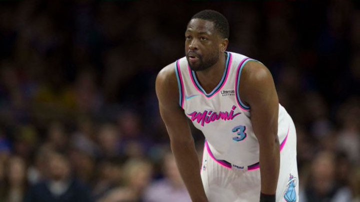
Looking at every NBA City edition alternate jersey and ranking the best of the bunch.
Nike took over as the NBA’s uniform supplier for the 2017-18 season, adding America’s second-most popular league to its monopoly over the country’s sports designs. Since assuming control of the NFL’s unis in 2012, they have been less influential than expected, barring six re-designs — those were hit and miss, to put lightly. They will add MLB to their domain in 2019, and they already outfit 70 percent of Power 5 college football programs.
Phil Knight and co. dominate the sports uniform landscape. While the NFL’s one-helmet rule and heavily traditional leanings limit their creativity on that side of their customer list, Nike saw an opportunity to go big with pro basketball, whose uniforms are smaller and thus cheaper to make. A much more progressive and youth-oriented organization, the NBA was receptive to more designs and consistent change.
Each team was given four uniforms by Nike: the “Association” edition, the “Icon” edition, the “Statement” edition, and the “City” edition, the last of which were unveiled in late December. A number of teams also have throwbacks as fifth (yes, fifth) jerseys. The marketing campaign emphasizes a departure from the traditional “home” and “road” concepts, allowing teams to wear colors at home and creating a higher number of color vs. color matchups.
The City editions were more likely to be at least a little bit out there, because the designers already had gone through all of most teams’ alternate colors in the first three uniforms. They certainly were controversial; Nike, as they are apt to do, churned out modern classics and clunkers alike.
We rank all 30 City designs, starting with the worst of the worst.

30. Oklahoma City Thunder
The OKC Thunder have struggled with a core design problem since they came into existence 11 years ago: they’ve struggled to identify exactly what their main colors are. Their light-medium blue, navy, and orange colors have never truly meshed, even in the solid home and away looks they’ve worn throughout their brief history. Those issues were prevalent in dreadful past alternates, but their City edition set is the perfect manifestation.
In the NBA, which lends itself almost as easily as soccer to off-color alternates, going “gray-for-grays-sake” (i.e. using gray despite it not being a primary color) is usually a cop-out. That is what happened here: Nike had no idea what color to use. The navy Statement look is fantastic, but with these, they flat-out admitted that they didn’t have any other ideas.
They incorporated yellow on the outline of the numbers for some reason, and the aimless orange and blue swipes(?) were a failed attempt to salvage some creative element of this abomination. If their mascot was a fierce animal of some sort, perhaps the stripes could function as a loose reference to claws. Instead, they add precious little to an ugly gray base and an unclear attempt at imaginativeness.
