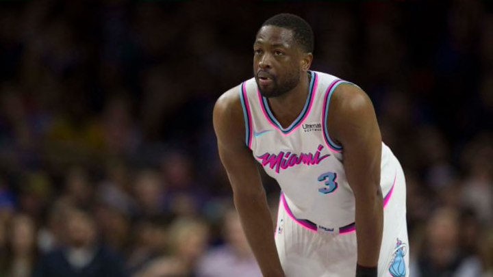
19. Minnesota Timberwolves
Minnesota hit it out of the park with the brand new set of uniforms they unveiled in August. Their three unis follow the same template — always a positive — and it’s terrific, with expertly designed shoulder colors that incorporate white and find the perfect way to integrate their ad, which isn’t too burdensome. They cleaned up their color scheme and updated it with a slick and unique blue and blue combo, to go along with the terrific green that makes up their Statement edition.
Compare the new set with their old one and you’ll see just how much of an upgrade this was. I can’t speak enough about how magnificent these are; they have a legitimate argument for being the best set in the NBA.
Their City edition did not live up, though. They went gray-for-grays-sake (GFGS) and decided against using any of their primary colors in the design, going instead for a clean light gray and white. In itself, it kiiiiinda works, with a design that isn’t really that bad. But white and gray need another color.
Add some blue and they’ve got something at least somewhat better than this. It’s a travesty they didn’t follow Utah’s lead and utilize their state’s geographical wonders somehow. Their name lends itself to that, not an ambiguous light gray.
