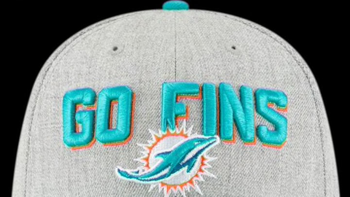
It’s been a good run for hat enthusiasts since New Era returned to the NFL game, but the hats they’ve designed for this year’s NFL Draft are a huge misfire.
Let’s start with a bit of disclosure: I’m not the FanSided.com NFL editor, nor am I an NFL expert in any way, shape or form. I’m not qualified at all to discuss the finer points of the NFL game with any authority and leave that to my colleagues. I am, however, a hat aficionado, owner of more fitteds and snapbacks than I’d care to admit. As such, I was anxious to see what New Era whipped up for the 2018 NFL Draft, which is only a few weeks away.
It’s easy to forget now, but there was a long, dark time that New Era didn’t have a license to make NFL hats based on current team logos, and we enthusiasts suffered greatly for it. Most of the caps Reebok made when it was doing its own headwear as the NFL’s official uniform supplier were, in a word, brutal.
So this is not meant to disparage New Era in general, as the company has supplied me with most of what’s in my closet and generally comes correct with its NFL Draft hats. That said, the line it unveiled today is awful, a huge miss in both design and execution.
The high concept isn’t inherently terrible, as there’s only so much one can do with just the team logo, so the 2018 NFL Draft hats go a different direction by incorporating one team slogan associated with each team on the front and another on the inside of the sweatband — where no one can read it, but hey.
The problem is that while a bunch of NFL teams have cool phrases that people associate with them immediately, like “Just Win, Baby” for the Raiders or “Keep Pounding” for the Panthers, many do not have one, let alone two. This truth led to some laughable results like San Francisco’s cap getting “Niners” on the front and “Faithful” on the inside. Miami is another unfortunate team with “Go Fins” and “#Fins” as its two phrases. Agh.

Some of the teams also have very wordy phrases that reduce the team logo to almost an afterthought. The whole layout just reminds one of cheap caps from a bygone era, a design that is retro in the wrong way.
In other words, I agree with most of the comments on this tweet, accusing them of looking like potential knockoffs:
Then there’s the fact that while the official hats are fitted, they are low profile deals with brims intended to be curved. In other words, they’re close to what has unironically come to be known as “dad hats,” which makes sense because that’s what’s in right now.
Hat style is cyclical, so flat to curved brim, high to low profile and fitted to snapback are pendulums that are constantly swinging. That said, when bigger crowns and flat brims are in, they’re a little more inclusive of people with big heads (like yours truly) and flat brims can always be curved. It’s hard to imagine some of the hulking offensive and defensive linemen in these bad boys on the first night of the draft, but we’ll see.
Next: So long, Color Rush uniforms
The silver lining is that New Era generally offers alternate versions of the “official” draft caps to give people more options. Here’s hoping that’s the case when these go on sale, because otherwise, I’m not going to be pulling the trigger on these, and I suspect I won’t be alone.
We love you New Era, but please do better next season.
