30 most iconic logos in sports

What’s in a logo? Every team is defined by the logo on the front of their jersey, not the name on the back.
The name on the back changes from year to year. The logo on the front, for the most part, remains the same.
Consistency is key in finding an iconic logo. If your team changes the logo every five years, it was probably bad and it can’t be iconic. Many logos on this list have been around since the dawn of time and have remained the same despite Nike’s input.
Other criteria for this list:
The dad test: I asked my dad (a casual sports fan) to identify logos. If he knew them, they must be memorable. If he didn’t know them, he was lying all those times he said, “Yes” when I asked him, “Do you understand what’s happening?” during a game.
The pop culture test: If the logo appears across multiple pop culture platforms, it’s worthy enough to make the list.
Personal preference: Look, it’s a list. It’s not a ranking, but it’s a list. Every list is flawed and filled with personal preference. Your grocery list is going to look different than my grocery list. I like Oreos. You like graham crackers. You’re weird and wrong. What you deem iconic might be different than what I deem iconic. My bar is set at Billie Kay and Peyton Royce.
A super complicated algorithm: So complicated that I cannot reveal the inner workings of the algorithm to the masses. But just know Daryl Morey’s head would explode if he saw it.
These are in no particular order.
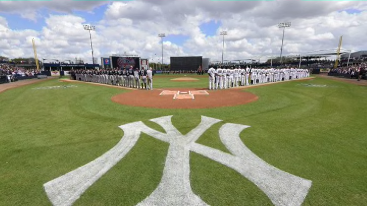
New York Yankees
Jay-Z once rapped, “I made the Yankee hat more famous than a Yankee can.”
Jay-Z also once rapped, “I don’t wear jerseys, I’m 30-plus” and then wore a Colin Kaepernick jersey on Saturday Night Live at the age of 47. What I’m saying is, Jay-Z is a liar. He does wear jerseys. And he did not make the Yankee hat more famous than a Yankee can.
Fred Durst made the Yankee hat more famous than a Yankee can.
Admit it, if you were a teenager in the late ’90s and early ’00s, you wanted a red Yankees hat. Even if you were a Red Sox fan, you wanted a red Yankees hat. Alright, maybe not if you were a Red Sox fan. But Mets fans definitely wanted one.
The Yankees logo is arguably the most iconic logo in all of sports. The only one that comes close to it, in my mind, is the Dallas Cowboys logo.
The brilliant thing about the Yankees logo is the simplicity. It’s memorable because it’s basic. It’s just the initials NY. The Y not only represents the York, it represents the Yankees. It’s like how the WWE logo is two stacked W’s, but you can take one of the W’s, turn it sideways and stick it straight up….into an E.
Yes, WWE copied the Yankees logo. There’s a fact that you probably didn’t know.
The Yankees logo is older than your grandparents. Unless your grandparents are the oldest people still living. In which case, that’s pretty awesome. Did they help design the Yankees logo?
Chicago Cubs
The Cubs logo is just a giant C followed by the letters “u-b-s.” Unlike other logos that are also just a C, this is a perfect looking C. Just typing the letter means typing the Cubs logo.
But how cute is the bear that is sometimes involved? The bear’s name is Cubby and he has watched over your shoes and pre-school gatherings all your life.
The Cubs logo has become iconic thanks in part to Bill Murray. There’s a rumor that Murray has never left the house without the Cubs logo on. I fully believe it. He’s either wearing a hat, a shirt, or underwear with the logo on. He went to the White House, interrupted whatever they do in the White House, and gave a speech decked out in Cubs gear. He’s a walking Cubs billboard.
Now, think about the most famous non-celebrity fans in sports. It’s a pretty short list, right? There’s the guy who got rejected proposing on the big screen. There’s the crazy dancing kid. There’s everyone who tried interacting with Russell Westbrook and nearly got killed. And then, there’s Bartman.
Bartman once rapped, “I made the Cubs logo (and headphones) more famous than a Cubs can.”
Unlike Jay-Z, he was telling the truth. Bartman made the Cubs logo iconic for all the wrong reasons. Until Theo Epstein arrived and saved the day.
The other person we must credit for the Cubs logo becoming so iconic is a kid by the name of Henry Rowengartner. If you don’t know that name, please go watch the movie Rookie of the Year. It’s the second best baseball movie ever.
Chicago White Sox
Sticking with my rap theme, 50 Cent rapped, “(People) wearin’ flags cause the colors match they clothes, they get caught in the wrong hood, and filled up with holes.”
It’s a reference to Crips and Bloods. Blue and Red.
Years before 50 Cent spit that line, rap group N.W.A. (sort of) united the two gangs by wearing black and white. And their black and white ensemble wasn’t complete without a Chicago White Sox hat.
Eazy-E was rarely photographed without a hat on. He’s most famous for wearing a black hat with “Compton” spelled out in white. But the White Sox hat was a big part of his cap rotation. Ice Cube thought the colors and writing style was “perfect for [N.W.A.]” and why they went with a White Sox cap despite being from Los Angeles.
The trend of the White Sox logo dominating the hip-hop culture didn’t stop with N.W.A. Kendrick Lamar, another Los Angeles rapper, was on the cover of Rolling Stone wearing a White Sox jacket. Chance The Rapper often wore a White Sox hat and collaborated with the team on special edition hats, before the relationship between the two went sour.
Jay-Z did not make the Yankee hat more famous than a Yankee can. But some of the best and most revolutionary artists to come out of Los Angeles and Chicago definitely made the White Sox hat more famous than a White Sox can.
Boston Red Sox
Whether it’s the Big Red B (not to be confused with the Big Red Machine Kane or the Big Red Dog Clifford) or socks that are literally red, everyone knows what the Red Sox logo looks like.
Once again, simplicity is king when it comes to baseball logos. The best logos are just letters with a distinct feature. In the case of the Red Sox, their distinct feature is using Tuscan font masquerading as a custom font that they call Bosox.
Say what you will about Boston sports, but they know how to do a simple logo and have it pop. You’re going to read plenty about Boston logos in the upcoming slides. Except for the Patriots. Their logo isn’t iconic. Tom Brady’s TB12 logo is more iconic than the actual Patriots logo.
You know who we can blame for the Big Red B becoming so iconic? Jimmy Fallon.
Sure, Matt Damon and Ben Affleck are heralded as the two biggest Red Sox fans, but it was Fallon who made an entire movie dedicated to the Red Sox. And as luck would have it, it happened to be the same year they broke the curse. Fever Pitch is a good movie taken to a new level because the Yankees blew a 3-0 lead. If that comeback doesn’t happen, the Red Sox logo is still iconic due to the history and simplicity, but it’s Fallon’s fault that it’s the second most recognizable logo in baseball.
Cleveland Indians
Major League. It’s the greatest baseball movie of all-time and if you think differently, you can kindly make your way to the next slide. If the Cleveland Indians allowed Charlie Sheen to throw out the first pitch in the World Series, they would have won and we’d still be talking about the curse of the Billygoat. But no, Cleveland, contrary to Drew Carey’s belief, did not rock. And they lost.
While simplicity rules in baseball, the Indians take a different approach. Their logo is a giant smiling Indian. The fact that he’s smiling makes him cuter than the Chicago Cub. It’s a warm and welcoming feeling, making you forget all about the fact that you’re in Cleveland. If the Indian were a true representation of what it’s like to live in Cleveland, he would be depressed.
It’s fair to say the Indians logo is iconic for the wrong reasons, activists don’t see Chief Wahoo as smiling, they see him as an offensive, discriminatory and harmful caricature. I choose to take a positive approach. Chief Wahoo is iconic because Willie Mays Hayes was legging out ground balls and Pedro Cerrano was crushing fastballs.
Now, the Indians are reportedly changing their logo starting next season. This makes them more in touch with what’s happening in the world than the Redskins. It also makes Chief Wahoo a nostalgic figure.
Dallas Cowboys
It’s a star. They could have gone with a pair of boots or a giant cowboy hat. They could have used a revolver, which would be subject to a petition to change over the last year. There are dozens of different items related to cowboys. And the Dallas football team went with a star.
Brilliant.
Jerry Jones purchased the team in 1989. Rumor has it that he was so drawn to the star, thinking it was a perfect representation of himself, that he paid an extra $10 million for the club.
You know why Dallas calls itself America’s Team despite most of the country disliking them? It’s because 50 of their logos are on the USA flag. You don’t see a giant NY on the USA flag, do you? No, because the Giants are not America’s Team, despite their team colors.
The logo is double brilliant because everyone says, “play for the logo on the front, not the name on the back.” Well football jerseys don’t have logos on the front so the saying is “play for the logo on the helmet, not the name on the back.” The logo on the helmet is a star. You could be playing for the logo on the helmet and the name on the back. You ever wonder why Dallas attracts divas? There’s your answer.
This list is in no particular order, but if it were, the Cowboys would be No. 1. They have the most iconic logo in all of sports because it’s more than letters. It’s a symbol of excellence. Like holding up four fingers.
Pittsburgh Steelers
Pressure makes diamonds and someone stuck those diamonds on the Pittsburgh Steelers logo. Diamonds are forever and so is the Steelers logo.
Pittsburgh loves to brag about all their professional sports teams having the colors black and yellow. Wiz Khalifia made an entire song about Pittsburgh sports. But the Steelers are more advanced than your average Pittsburgh team. Looking at you, Pirates.
While they use the black and yellow colors, they add some more color to their logo. The diamonds are yellow, orange, and blue. For those that don’t know, yellow represents coal, orange is ore and blue is steel scrap. Thanks, Google.
In further proof that Pittsburgh is ahead of the game, they only have their logo on one side of the helmet. The organization thought so much of this logo that they said, “We only need it on one side of the helmet.” And it’s worked. It has set them and their logo apart from every other team in the league.
The one knock against this logo is that it was originally used for education purposes. This has nothing to do with how recognizable it is and how it’s stood the test of time, but it’s an interesting fact. According to the Steelers website, “The logo was used as part of a major marketing campaign to educate consumers about how important steel is in our daily lives.”
Water. Water is an important part of our daily lives.
Don’t try to educate me with a football logo, Pittsburgh. There’s a little thing called school for that.
Green Bay Packers
In life, there are certain things that you can’t teach. For example, being seven feet tall. You can’t teach that. Being a bonafide stud? You can’t teach that. And if you’re a certified G, that can’t be taught.
Everyone on the Packers is a certified G. It wasn’t something they were taught. Jon Gruden’s Quarterback Camp did not prepare Aaron Rodgers to be a certified G. It was something he was drafted into.
It took Green Bay ten years to realize they should be certified Gs. Their first logo was the word “Packers” in front of a football that Tom Brady got his hands on. Their second logo was a javelin thrower holding a football in front of a the state of Wisconsin stuck on a football. If that sounds complicated, it’s because the logo was super dumb. Imagine seeing that logo nowadays. It’s busy, it’s ugly, and it would rightly be crucified if they attempted to use it in 2018. Rodgers would would be no better than Johnny Manziel if the javelin thrower logo still existed.
Finally, some genius in Green Bay decided, “Let’s just make our logo a G.” And the rest, as they say, is history.
This is further proof that the best logos are simple. The Packers took the first letter of their name, stylized it, added color, and made it their logo. It’s not the initials of the city. It’s not a stuffed box labeled “Packers” or a clip art picture of packing tape. There’s no cheese. It’s one letter. And you can’t. Teach. That.
Chicago Bears
No, your eyes do not deceive you. The Chicago Bears logo is just a grown up version of the Chicago Cubs logo. Even though the Cubs came first, the Bears were smart enough to mooch off the Cubs success by naming themselves the Bears.
What the Bears were really saying is that football is a man’s game while baseball is a kid’s game.
Even the C in Chicago is nothing more than the C in the Cincinnati Reds logo just scrunched together a bit.
Basically, the Chicago Bears are nothing more than the Cincinnati Cubs. Thanks, Obama.
Despite the not so subtle shots at the Cubs and the blatant thievery of the Reds and Cubs logos, the Bears logo has learned to stand on its own. It is a bear, after all.
The Bears logo is mainly iconic thanks to the Saturday Night Live sketch. If Bill Swerski didn’t exist, we would all frown upon the Bears logo. We would call the organization out for being unoriginal. But Bill Swerski exists and we don’t think twice about the logo. We just say, “Da Bears” and think about how cute the bear would be if it were a cub.
Some may point to the success of Brian’s Song as to why the Bears logo is so iconic. That line of thinking is false. The Bears logo is never featured in the movie. Watch it again. If you can spot the logo through your tears, then you’re not properly watching the movie.
Washington Redskins
Perhaps the most famous logo for all the wrong reasons. The Washington Redskins logo is iconic, but that doesn’t mean it’s beloved. In fact, it’s quite the opposite.
The majority of people want the Redskins name and logo changed as its an offensive word for and cartoon of Native Americans. The logo has been around since the Redskins were founded in 1933. It changed in the ’60s and ’70s to a slightly more friendly arrow and R, but then went back to the Native American profile shot in 1972.
The National Congress of American Indians, a group with over one million members, have led the charge against changing the name and logo. In 2015, they successfully lobbied the State of California to ban the term “redskins” as a slur. In the last ten years, many tribal organizations and civil rights groups have attempted to get Washington and the NFL to change the name/logo with no success.
The South Park episode “Go Fund Yourself” highlighted Washington’s refusal to change name/logo and how it became the mark of a team who does nothing. Unbreakable Kimmy Schmidt took a step farther in season 3 with their takedown of the Snyder family.
They say “any publicity is good publicity” and if that’s true, the Redskins have been getting good publicity over their logo for years.
Unfortunately, the Redskins logo won’t change anytime soon. The outrage over the team name and logo is like 14th on the list of NFL concerns right now. Just after discipline for players who don’t fulfill media obligations.
Oakland Raiders
I love the Raiders logo because it’s evolved over time without changing what it truly is.
The Raiders logo is a man with an eye patch and two swords behind him. In the ’60s, he wore something resembling a football helmet. And it’s never changed. He painted his helmet and upgraded his swords, but he’s still the same person he was over 50 years ago.
Let the Raiders logo be an inspiration to us all. No matter what happens in life, stay who you are. With minor upgrades and maybe a new hat.
When you think silver and black, the only team that comes to mind is the Raiders. They are the Bret Hart of the NFL. Except with silver and not pink. Although I’m looking forward to an XFL team adopting pink and black colors.
Much like the White Sox, the Raiders received a pop culture boost from the rap group N.W.A. How many teams wish they had a black and white/silver color scheme when gangster rap hit the scene?
By dressing up as Mad Max extras for every game, Raiders fans played a big part in making the logo more memorable. When people think of the Raiders, one of the first things they mention are the fans. Plenty of fans bring their logo to life. But it’s easy dressing up like a viking. No fanbase take it to the length of Oakland fans and I mean that as the highest compliment.
Now, when Miami fans start dressing up like dolphins, then Oakland will have some real competition.
Philadelphia Eagles
Despite their masks during this recent Super Bowl run, the Eagles logo is not a slobbering dog.
It’s an eagle.
A fierce eagle at that. One look at the Eagles logo and you immediately think, “That’s an eagle who is here to chew bubble gum and play with his roadkill. And eagles hate bubble gum.”
The logo, in its current form, has not been around too long. It debuted in 1996. It used to be a full bodied eagle but Philadelphia fans didn’t want a full bodied eagle tattoo taking up their entire back. So, the Eagles organization changed the logo to just the head, allowing Philadelphia fans to fit the tattoo nicely on their arm.
The cool thing about the Eagles logo is that the feathers form an E. Little things in logos go a long way. They can take a basic design and make them unforgettable. The other cool thing about their logo is that it’s not on the helmet. Instead of plastering the logo on the side of the helmet, the Eagles just go with wings. Of course, those wings aren’t the same wings as the Eagles logo. Did you know eagles have many sets of wings?
The real value in the Eagles logo comes from pop culture. The Eagles logo is so mesmerizing that Mark Wahlberg abandoned his Patriots fandom to do the movie Invincible. Plus, there’s Silver Linings Playbook, which is about an Eagles fan who is depressed through the Andy Reid era. And of course, Always Sunny In Philadelphia, where the Green Man and the Eagle are like the real life versions of Peter Griffin and the Chicken.
New York Knicks
Do you know why the New York Knicks hired Phil Jackson in the first place?
It wasn’t due to his historical greatness as a head coach or because he promised James Dolan the greatest peyote ever. It’s because behind the basketball and giant KNICKS lettering in their logo, sits a triangle.
Forget the Eagle staring into Mark Wahlberg’s soul and telling him to convert to Philadelphiasm. The Knicks logo is so powerful that it led to them hiring a man with no executive experience as their top executive.
The logo has remained more or less the same since the ’60s, just growing as the world often does with each passing year. It started out with just the KNICKS lettering hovering over top of a basketball. Because, you see, the Knicks are more important than basketball. Basketball will fade into obscurity with the next 10-20 years when robots rule the world. But the Knicks will live forever.
The triangle was added in 1992. That’s how long the Knicks courted Jackson. Imagine how much different NBA history would be if Jackson left the Bulls in 1992 to coach the Knicks. Patrick Ewing would have a ring. Probably.
The addition of New York was forced on Dolan by the league offices. He just wanted the team to be known as Knicks. Like Prince or Oprah. But the league told him the city name must be present in the logo. So Dolan made it the smallest part of the logo. If he has to share a state with the Nets, the state isn’t all that important.
Boston Celtics
Perhaps the most famous logo in the NBA. The Celtics logo started out simplistic. It was just a green circle with a shamrock and the word CELTICS. It looked straight out of a Schoolhouse Rock cartoon. Red Auerbach’s brother, Zang, designed the leprechaun logo that looked more like a court jester.
It’s good that Red was one of the best coaches in NBA history because his brother did him no favors with the logo he designed. Into the ’70s, the Celtics added a red basketball because they really loved Red Auerbach.
Finally, they settled on the logo you currently see, only adding a splash of color in the ’80s.
The worst thing about the Celtics logo is the smugness of the leprechaun. Look at him. Spinning the basketball on one finger like he’s LeBron James against the Raptors. Holding a shillelagh that he definitely doesn’t need. Smoking a pipe that’s probably filled with ground clover. Winking because he’s hiding a pot of gold somewhere. Or winking because the Celtics have more championships than any other team. Maybe winking because Brad Stevens is their head coach and not yours. I don’t know. He has a lot of reasons to be winking. That’s what makes him insufferable.
And look at all the clovers as part of his wardrobe. It’s like the McDonald’s employee forgot to put a lid on the blender and the shamrock shake went everywhere.
No one takes more pride in their logo than Celtics fan. To find out more about how much pride they take, watch the movie Celtic Pride. It’s a preview of the 2020 NBA Finals and stars Donovan Mitchell.
Los Angeles Lakers
There’s nothing fancy about the Los Angeles Lakers logo. For a team that prides itself on flashiness and making a splash, their logo barely makes a ripple in a lake. Their logo is a basketball behind the team name. There’s a speed effect on the lettering to represent how fast free agents are fleeing to the Lakers.
Despite the lameness, it’s stood the test of time. While other teams have undergone massive changes, the Lakers have kept the same template since moving to Los Angeles. Not only did they keep the same template, but the Clippers stole their template before finally realizing that they should try and be their own team.
Maybe get your own arena as well, Clippers.
We can credit Magic Johnson, Wilt Chamberlain, Kareem Abdul-Jabbar, Jerry West, Shaquille O’Neal, James Worthy, or Lamar Odom for making the Lakers logo famous, but that would be giving the players too much credit. Some of them already have statues built in their honor. One is the actual logo of the entire league. They’ve been given enough credit over the years.
Sadly, the Lakers logo as we know it will be changed soon enough. I don’t want to spoil their plans, but lets just say that six out of 24 fans will be excited about the new logo.
Chicago Bulls
Michael Jordan.
The Bulls logo is only iconic because of Michael Jordan. If Jordan isn’t drafted to the Bulls, they don’t win six titles and become the greatest team of the ’90s. The Portland Trail Blazers draft Jordan and the Bulls are left with Sam Bowie. Ask Portland fans how things have gone for them since then.
If Jordan goes to the Blazers, this spot is occupied by Portland’s logo. Their pinwheel is pretty cool and deserves more recognition. I wish Damian Lillard the best of luck and hope he can make the Blazers logo iconic. But as it currently stands, it’s not iconic. The Bulls logo is iconic. All thanks to Jordan.
You could’t leave the house in the ’90s without seeing Bulls gear around town. It’s like leaving the house today and seeing the Golden State Warriors logo on the east coast. When someone re-writes this slider in 10 years, the Warriors logo will make the list because the Warriors will have won 10 out of the last 12 titles.
The Bulls logo was founded with the team in 1966 and it hasn’t changed. Very few teams can say that. When Jordan joined the team, he became the logo. Take a close look at the logo. Look into the eyes and angry brow. Stare into the soul of the bull. You’ll see Jordan ready to punch Steve Kerr in the face.
This is one logo that should never change. It’s been perfect since it debuted in 1966 and it’ll be perfect in 2066.
Hartford Whalers
The only throwback logo on the list. Throwback logos are fun to wear on your clothes for a day before you get tired of kids asking you, “What team is that?” Learn some history, kid.
There are a few throwback logos that come close to iconic status, but the knock against throwbacks are that they don’t stand the test of time. They aren’t around today, and while that’s not the fault of the logo, the logo must suffer all the same.
The Whalers logo is here because it’s remained iconic despite the team moving to Carolina. You know a logo is iconic when the current team has been in existence longer and has been more successful, yet people still long for the days of the older team. If the Hurricanes moved back to Hartford, hockey fans would be in the streets celebrating.
There’s a lot to love about the Whalers logo. Hovering above the W is the famous whale tail. Both are colored in and represent the nickname and mascredot of the team. But do you notice the negative space? It’s an H to signify Hartford. The use of negative space is a lost art in logo making. The Washington Capitals are about the only team to pull it off nowadays.
The Whalers logo was ahead of its time.
Adam Sandler put the Whalers logo in the his movie Grown Ups. It wasn’t as prominent as another time he used a hockey logo in a movie, but at least it wasn’t beaten up by a game show host.
Boston Bruins
The Boston Bruins B. Does the B stand for Boston or does it stand for Bruins? The world may never know.
The answer is Bruins.
The Bruins B has been around since the ’30s. It started out as just a giant B and remained that way. Over the years, the team added some extra color, a circle, and spokes. The eight spokes represent the number of times Brad Marchand has licked a player. The spokes were added in 1948, long before Marchand was born, but the logo makers could predict the future.
Everyone knows the Bruins logo because it once got beat up by Bob Barker.
Boston Bruins. Bob Barker. B. Never tell me Adam Sandler wasn’t once the greatest comedic mind in the world.
It was Barker’s infamous fight with the Bruins B that immortalized the logo forever. Had Happy Gilmore been wearing a Winnipeg Jets jersey, their logo would be on this list. That’s how monumental that scene is in movie history.
Much like the Boston Celtics, the Bruins once had a Schoolhouse Rock logo of their own. It must have been a Boston thing. Schoolhouse Rock was created by New Yorkers. This is a new layer to the Boston-New York rivalry that you never knew existed until now.
While the Bruins B is the more iconic Boston logo, the actual bear isn’t far behind. The Bruins bear was part of the original logo, but it was overweight and had to go into early hibernation.
Toronto Maple Leafs
The Toronto Maple Leafs are the smartest organization in sports. They brilliantly decided to name their team after the national symbol of an entire country. It’s similar to what the Dallas Cowboys did with their logo. Except they didn’t try to hide the fact that they wanted a maple leaf as their logo. They could have called themselves the Toronto Maple Trees and still used a maple leaf as a logo.
How come the Cowboys didn’t call themselves to the Stars? Dallas Stars has a nice ring to it.
The Maple Leafs don’t need pop culture to enhance their logo, but they’ll always have a place on the silver screen thanks to Mike Myers. You can’t watch a Mike Myers film without seeing the Maple Leafs logo. It’s a big reason why no studio will produce a Myers film in 2018. They don’t want their studio getting a reputation as being hockey fans.
There’s not much to say about the actual logo. Ever since they changed their name to the Maples Leafs in 1927, they’ve used some version of the maple leaf. They ripped the logo off the Canadian flag and stuck it on their jersey. They’ve enhanced the logo of the years in order to sell more jerseys. And that’s about it.
There are seven Canadian teams in the NHL. The Maple Leafs have the longest Conference Finals drought of all those teams. But their logo is the most recognizable of all seven teams. So, they’re doing just fine.
Chicago Blackhawks
Remember last slide when I said Mike Myers works in the Toronto Maple Leafs logo into all of his movies and that’s why no one allows him to make movies anymore? It’s still true, but Myers did make an exception.
Wayne’s World, without a doubt the best Saturday Night Live sketch turned into a movie, is a classic for hockey fans. If Myers had his choice, he would have worn a Maple Leafs jersey while playing the role of Wayne Campbell. But the sketch had to appeal to an American audience, and as we’ve learned with SNL sketches, Chicago sports fans are pretty easy to imitate and always good for laughs.
The Blackhawks logo checks all the boxes. It got the pop culture boost from Wayne’s World, it uses the Chicago C and they made sure to have a B in the nickname. Bulls, Bears, cuBs, Blackhawks. The only team that didn’t follow this was the White Sox. Their players were so offended at not having a B in their name that they disgraced the World Series so everyone referred to them as the Black Sox.
Unlike the Braves, Indians, and Redskins, the Blackhawks pay homage to a Native American hero with their (also controversial) logo. Black Hawk led a group of Native Americans against the United States in an effort to settle a dispute involving Native American land. He was unsuccessful, but at least he’s a famous Native American honored by a sports team and not a caricature of an entire nation.
Detroit Red Wings
Red Wing shoes were founded in 1905 in Minnesota, a state that claims to be the State of Hockey. They are not. Michigan has more claim of being the State of Hockey than Minnesota. Because Detroit has scored more than one goal in the Conference Finals in their history.
The Red Wings were founded in 1933. They borrowed from the Red Wings shoe logo, but only the red wing part. The rest of the Detroit logo is awesome and recognizable. And I say this was a man who rooted for Claude Lemieux.
The focal point of the logo is the big wheel in the middle. It’s a call to the Detroit motor industry. And you know what they say about big wheels. They keep on turnin’.
Of all the logos in sports, the Red Wings might be the most featured when it comes to pop culture. Uncle Joey was always wearing a Red Wings jersey despite living in San Francisco. Dr. Cox also wore a Red Wings jersey. He too lived in California. Tupac, another man for California, wore a Red Wings jersey from time to time.
This is how you know the Kings don’t mean anything in the grand scheme of things. The Kings had Wayne Gretzky during Full House and the rise of Tupac. And they still represented Detroit over Los Angeles.
But the most famous appearance of the Red Wings logo in pop culture remains Cameron wearing his Red Wings jersey while hanging out with Ferris Bueller all day in Chicago.
How did Chicagoans allow him to get away with such a thing?
Montreal Canadiens
Much like every other team in the history of sports, the Canadiens use a C as part of their logo. Imagine if the letter C didn’t exist in the alphabet. Sports would be doomed. Since the Maple Leafs stole the national symbol of Canada as their logo, the Canadiens had no choice but to respond in the most petty way possible.
They named their entire team after the country.
Even if you’re American or Swedish or Finnish or from any country not Canada, and you’re playing for Montreal, you’re a Canadien. You have to change your entire nationality if you are drafted to, signed by, or traded to Montreal. That’s how the NHL works and that how badly Montreal wants to be Canada’s team.
Now, how does the H come into play? I’m glad I asked. The H stands for Hockey. Just in case you forgot what sport you’re playing/watching.
There’s nothing subtle about the Montreal logo. When you look at it, you’re reminded that the team is in Canada and you’re reminded that you’re watching hockey. It would be like the Atlanta Falcons changing their logo to giant AF lettering. It could stand for Atlanta Football, American Football or A Fumbled 28-3 Lead.
Not only do the Canadiens represent Canada and Hockey in their logo, but their color scheme is red, white, and blue. They have all three major parts of the NHL represented in their logo: Canada, America, and Hockey. People make fun of the Canadiens for not winning a Stanley Cup since 1993. But if you think about it, they’ve won every Stanley Cup in history.
Edmonton Oilers
Much like Michael Jordan took the Chicago Bulls logo to a new level in the ’90s, Wayne Gretzky helped put the Edmonton Oilers logo on the map.
The Oilers logo hasn’t really changed since the team was founded in the WHA in the early ’70s. It’s always been some form of a circle with an oil drop at the top and the Oilers lettering spilling down. Except for the early 2000s when they introduced some grey meteor oil. What the heck was that thing?
In the 80s, the Oilers logo became iconic because you couldn’t watch the NHL playoffs without seeing it. Every year, Gretzky and company were there. And they weren’t there for a round or two. They were there until the very end. Google “Stanley Cup in the 1980s” and click on images. It’s nothing but photos of the Oilers and Islanders. So why aren’t the Islanders on this list when their logo is pretty iconic as well? Because the Islanders have been just mediocre in the last ten years.
Not the Oilers. They’ve been bad. Lottery pick bad.
If nothing else, you have to credit the Oilers. They 100 percent subscribe to the “either be the best or be the worst” theory. They don’t have time to sneak into the playoffs year after year just to get eliminated in the first round like the Minnesota Wild. They’re raising the Cup or up first at the draft.
This has allowed them to keep their logo in the spotlight since their inception. Well done, Edmonton.
Anaheim Ducks
The new Ducks logo, which is a D shaped like a duck foot, is actually a shoutout to Disney and Donald Duck for bringing them into existence. Mickey was insanely jealous and spiteful that Donald went behind his back to create a hockey team. Mickey had his own plans to create a hockey team called the Anaheim Mighty Mouses, but Donald schemed with Emilio Estevez to create the Anaheim Mighty Ducks.
Anyway, no one cares about the duck foot D logo.
The true iconic logo in sports history is the Goldberg duck-shaped goalie mask. Everyone across the world knows this logo because it’s an exact replica of the mask Goldberg wore when he backstopped the Ducks to a state championship. This logo became so iconic that movies and cartoons were made.
You don’t see cartoons about Red Sox do you? That would be a pretty boring cartoon.
Anaheim tried to move away from this logo in an effort to appease Mickey in his ongoing war with Donald. Mickey is still the Disney cash cow, after all. That was the reason Anaheim dropped the Mighty from their team name, feeling it was a slap in the face to Mickey. It’s also the reason they got away from the cartoon logo and settled on the duck foot D.
After years of arguing and Twitter shade, it was Goofy who reminded Mickey and Donald what good friends they used to be and that Corey Perry was not worth it. Mickey agreed. Corey Perry was not worth it. They became friends again, the Ducks dragged the Goldberg mask out of retirement, and Mickey helped fund the Vegas Golden Knights.
All of this is a true story.
Miami
Did you know that Miami players often refer to their school as “The U”? Even though their is no U in Miami. Unless you’re talking about the French spelling of the word. The French spell Miami as Miamu. The French are so classy.
The U logo is actually a selfish decision on the part of Miami. They laid claim to a letter that is not part of their name, all because they wanted to be known as “The University.” It didn’t matter that other universities were around before Miami or that other universities were more successful than Miami. The geniuses at Miami said, “We’re the only University that matters, we are The U.”
As a response, Ohio State started calling themselves THE Ohio State, as if there is another state called Ohio. Idaho is kind of close, I guess.
Miami can’t even pretend that it makes sense if you flip the U right-side up. Because then it’s an N. And there is no N in Miami. Not even the French spell it with an N. Miami should have gone with The W. Although that would have led to a lot of L jokes and Jameis Winston eventually eating them.
The U has become the most recognizable logo in college sports. So much so that it was put on a necklace and given the name The Turnover Chain. It was so large that even Ludacris, whose diamonds are reckless, commented on the Turnover Chain.
“At least there’s a U in turnover,” he said.
Duke
Living in North Carolina, specifically Durham, I’m bias when it comes to the Duke logo. North Carolina, especially the Triangle area, is a hotbed for college sports. They stuck the Panthers and Hornets in Charlotte to draw the South Carolina natives, leaving college basketball and college football to, no pun intended, duke it out at/around the state’s capitol.
The Duke logo is everywhere in Durham, assuming someone pays for it or doesn’t get caught abusing it. I can’t speak for other colleges across America, but I can say that Duke is stubborn when it comes to renting out their logo for licensing purposes, especially compared to UNC or N.C. State.
And maybe that’s why it’s so iconic.
The Duke logo is that unattainable person you just could not get in high school. No matter how hard you tried and how often you saw that person, they kept shooting you down. You even left cute notes on their car, talked to their best friends to put in a good word for you, even tried making them jealous. Didn’t matter. They weren’t about to date you, or anyone for that matter.
The more they turned you down, the more you wanted them.
Duke’s logo has become popular thanks to ESPN. During college basketball season, you can’t turn on ESPN without hearing about Duke. It doesn’t matter if they are winning, losing or not playing at all. Someone of the broadcast will bring up Duke. And Kentucky, but who cares about Kentucky?
UNC
Once again, I fully admit that I’m probably showing my North Carolina bias. UNC has three logos that could all be considered iconic. That’s a pretty impressive feat. We can once again thank Michael Jordan because everything he comes across turns into gold. Well, except the Washington Wizards logo. Gilbert Arenas kind of undid any good Jordan did for the Wizards logo. And Jordan didn’t do the logo much good anyway.
Take your pick on the UNC logo. Whether it’s the NC letters, the ram, or the foot with tar on its heel. All of them are recognizable and stand out in their own way.
The logo that most people know is the NC lettering. There is nothing fancy about it. It’s just NC, although if you rotate the C, it’ll look like a U. If you rotate the N, it’ll look like a Z. The Z stands for Zombie. Little known fact about zombies. Everyone knows you have to shoot them in the head twice to kill them. If you try shooting them in the foot, tar comes out.
Not only does UNC have three logos that have stood the test of time, they legitimately invented a color with the logo. Whenever you see sky blue, your first thought is UNC/Carolina blue. Maybe it’s a North Carolina thing and people don’t recognize UNC blue in California. I’m actually very interested in this. If you live in California, please tell me if you call sky/UNC blue by its environmental name or its sports name.
Texas
As we’ve seen throughout this list, logos typically go one of two ways. Either they are simple and easily identifiable letters. Or they are crazy cool logos with enhanced features.
The Texas Longhorns logo finds itself in-between those two categories.
The most iconic Texas logo is the outline of a longhorn bull, filled in with orange or white, depending on the background. It’s the unique look of an enhanced nickname logo combined with the simplicity of the city lettering.
The longhorn bull has been around since the 1800s, which is like the 1600s in bull years. Texas has tried to enhance the bull over the years by adding a cowboy hat and, for some reason, a sailor’s hat. Because nothing scares away the competition like a bull wearing a sailor’s hat. I can only assume that the brainiacs behind adding a hat to the bull have never tried to actually put a hat on a bull. They also tried to give the bull a personality, but that’s been a mistake as well.
You know why artists don’t put silly hats on scary looking logos? Because scary logos don’t need silly hats. Putting a football helmet on a dolphin is fine. Dolphins are the dogs of the sea. You don’t see Jacksonville putting a helmet on the Jaguar or Arizona putting sunglasses on the Coyote.
Knock it off, Texas. Just because “everything is bigger in Texas” doesn’t mean you have to go over the top with your logo. A hat doesn’t mean “Texas back.”
Notre Dame
We’re not talking about the interlocked ND logo. That logo is fine, but it’s not nearly as recognizable and iconic as the Fighting Irish logo. The interlocked ND is honestly an ugly logo and there is a reason why Notre Dame does not put it on their helmets. They are inherently embarrassed by it, but it’s been around forever, so they don’t change it. They just use the Fighting Irish logo more.
What would happen if the Notre Dame logo fought the Boston Celtics logo?
It may seem like a mismatch on paper. The Notre Dame logo is known for its fighting acumen. He has his hands up, balled into a fist, and ready to throw down at a moments notice. He’s had to fight Cardinals, Blue Devils, Demon Deacons, Wildcats, Trojans, Hurricanes, and Trees over the years. Those are no slouches. The Celtics leprechaun is facing numbers, lakes, and a sword without an owner. Not exactly tough competition.
But here’s the thing, the Celtics leprechaun has a shillelagh and there is some performance enhancing drugs in his pipe. Yes, ground clover is considered a performance enhancing drug. It’s how Nick and Nate Diaz became two of the best fighters in the the world.
Now, I’d still give the edge to the Notre Dame logo. He has the experience and has fought better competition. But don’t count out the Celtics logo. Not only does he have a shillelagh and is on PEDs, but he has more lucky clovers and is supremely confident. Probably because he’ll be cornered by Brad Stevens and not Mike Brey.
Michigan
I imagine Michigan State fans will be upset that Michigan made this list while Michigan State did not. There is a reason for this. And that reason is, as I explained in the intro, this is my list.
Also, some people tend to confuse the Michigan State Spartans with the USC Trojans. I don’t know how anyone could make that mistake, but to some people, Spartans and Trojans look alike. Note to people who think Spartans and Trojans are the same: Spartans were led by Gerard Butlers. Trojans were led by horses.
Instead of making their logo a Wolverine, Michigan went with the simple M to define their school. As we’ve learned throughout this slideshow of history, you can never go wrong with the first letter of your city/nickname. Michigan not only stands for the school name, it stands for the entire state. Every professional sports team in Michigan is located in Detroit.
Newsflash, there are more cities in Michigan than just Detroit.
Michigan encompasses the entire state in one logo. If you’re from Michigan, even if you’re a fan of Michigan State or Alma College, the M is present in your life. Did you know that there is an M in Michigan State. Sorry, Spartans, y’all lost this logo battle.
But hey, the Spartans have won eight out of the last ten football meetings between the two teams. And that’s more important than winning the logo war.
NEXT: 30 best NBA poster dunks of all time
Except in this article. Logos are the only thing that matters.