
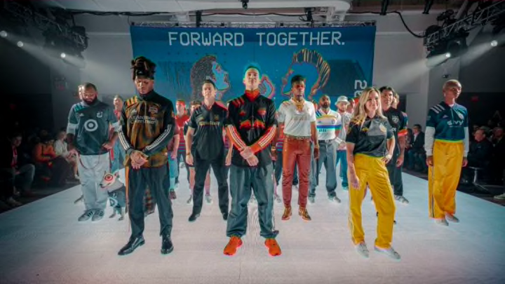
The 2020 MLS season opens with a special 25th anniversary collection of jerseys for each team. We attempt to rank all 26 new MLS kits.
MLS is celebrating its 25th season in 2020, and the league marked the anniversary with a collection of new Adidas jerseys for each club.
The collection is a mixed kit bag, some use iconic design elements from club history while others are seemingly meaningless patterns or don’t deviate far enough from the template to be notable. Here we attempt to rate all 26 new MLS kits for the 2020 season:
1. Minnesota United FC

The wing returns! An iconic callback to the Loons’ NASL days is one of the league’s best looks (though a little tough to see here) and a welcome nod to history that goes beyond MLS.
2. Sporting Kansas City

The light blue dots on the dark blue are pure class. The solid shoulders do a disservice to this one, though the silver accents pop nicely.
3. New England Revolution

The Revs are the only remaining MLS original not to adjust their crest in any major way so it makes sense that their 25th anniversary kit is one of the best. The bold white stripe invokes the Revs’ classic, very 90s MLS crest.

4. New York Red Bulls

Excellent execution of what is ultimately a simple kit. The red accents pop off the black.
5. FC Cincinnati

The orange shoulder stripes here are some of the best use of adidas’ signature look this year. They pop nicely off the blue and the two-tone split down the middle is interesting without doing too much. Things haven’t been so great for FCC lately, but at least they will look sharp in year two.
6. Orlando City SC

Does it sort of look like a white shirt that got washed with a load of reds? Maybe. Does it have some tie-dye vibes? Yes. But the more I stare into the radiating sun of purple Lions’ manes, the more I like it.

7. New York City FC

The pattern on NYCFC’s “Gotham Kit” is “inspired by the iconic architecture of the Brooklyn Bridge.” The unique pattern is nice, but my only concern is whether without the right light, or on the field, it might look too much like a plain blue top.
8. Portland Timbers

There is supposedly faint grey wood grain running across this one, but it’s are so faint you wouldn’t know unless you had it in hand. That downgrades a would-be classic to a solid stripe.
9. D.C. United

A classic. The Adidas-template three shoulder stripes harken back to this MLS original’s first jersey with white stripes across the chest. It’s nothing crazy but they didn’t mess it up. It just looks right.
10. Atlanta United FC

Another MLS kit that almost suffers from being too plain, but Atlanta’s commitment to the all-gold-everything audaciousness pulls it off.

11. Philadelphia Union

The sublimated snake on the chest is great, but seems like it won’t actually be noticeable unless you’re right up close.

12. Real Salt Lake

Let’s get weird! RSL and Adidas have some how taken the random-pattern look beyond the point of making sense and brought me all the way back in for RSL’s excellent adventures.
13. Toronto FC

Toronto’s red and grey always work together well, making this the best of the seemingly random pattern category.
14. Colorado Rapids

The Rapids great color scheme rescues another plainly patterned kit.

15. LA Galaxy

The Galaxy’s sash is one of the best consistent design elements in the league. While the silver is a tribute to the MLS original club’s 25-year silver anniversary, it’s disappointing not to make better use of the Galaxy’s iconic blue, white and gold palate, or even throw it back to use some of the club’s original green, gold, black and red.

16. Los Angeles FC

The defending Supporters’ Shield winners are sticking with their already recognizable black and gold. It’s a good look that has worked well for them, but there’s not much to say here.
17. Vancouver Whitecaps FC

The Caps wavy blue kit is very nice, invoking the Vancouver flag, but it seems like the stripes may be too subtle to stand out (as shown above) unless viewed up close.
18. Chicago Fire

This would be a great secondary kit for the Fire. But it loses points as the first-ever non-red home kit for a club traditionally known to fans as the “Men in Red.” This has been dubbed the “Homecoming Kit” as the Fire prepare to move back downtown to Solider Field, but it seems wrong to mark your homecoming in what has always been your secondary color.
19. Seattle Sounders

The defending MLS Cup champions‘ rave green is iconic at this point, and this one isn’t bad at a glance, but the striping does have some serious Very Hungry Caterpillar vibes to it.
20. FC Dallas

This year’s take on Dallas’ traditional hoops are rendered in blue at various thicknesses down the shirt. It’s a pretty good FCD shirt but nothing special.
21. Houston Dynamo

Another entry in the “wild pattern” category. Apparently the “graphic orange print on the black fabric … is designed to represent a city that never stops.” OK, sure. Luckily, the orange and black always play together pretty well no matter what.
22. San Jose Earthquakes

The colors are borrowed from the city flag, but it is a little awkward borrowing so closely from their rivals in LA. The spacing of the various stripes and sponsor feel off.
23. Inter Miami

So much potential, yet so disappointing. With one of the best color palates in the league and a beautiful logo, Miami missed a chance to make a statement with their debut kits. The sublimated heron logos are nice, as are the pink stripes, but it’s not nearly enough.
24. Columbus Crew SC

The checkerboard look is supposedly drawn from the checkerboard on the club’s badge, but the weird heat-map patterning is seemingly random and doesn’t look particularly good.
25. Montreal Impact

How do you say bland in French? This kit is far too meh for a team managed by the ever handsome, elegant Thierry Henry.
26. Nashville SC

Solid introduction of their color palate, nothing spectacular but nothing embarrassing.
A new vibe in Music City.
— Nashville SC (@NashvilleSC) February 6, 2020
Introducing our inaugural @MLS away kit. #FORWARD25 #EveryoneN | https://t.co/G42GZk3RCJ pic.twitter.com/7IjUcAxV0g
Sounds familiar to Nashville’s hopes for their expansion season.