The Tampa Bay Buccaneers will be coming out with a new logo at some point, and there’s only one way to go if they want to avoid Rams-style backlash.
An original tease of the Los Angeles Rams’ new logo appears to be fake, at least until we see the hats given to their drafted players, but an official unveiling of their new logo on Monday was met with the expected negativity from the internet masses. In a broad sense, the Tampa Bay Buccaneers can take a lesson.
In the wake of Tom Brady’s signing, Buccaneers’ merchandise has experienced the expected serious sales spike. This is despite it not being known what number he will wear, as sales of Brady’s jersey surely account for much of that increase, and it not being known what the Buccaneers are doing with a new logo they are set to unveil at some point. Of course orders will be filled when those things are official, but the increased hype attached to the Buccaneers is creating extra anticipation for their new logo.
The Buccaneers moved to dark orange/red and pewter as their primary look in 1997, with a flag/skull and crossbones logo that they have maintained up to now.
But when they do unveil their new logo, there’s only one way to go if they wish to avoid a Rams-level of backlash.
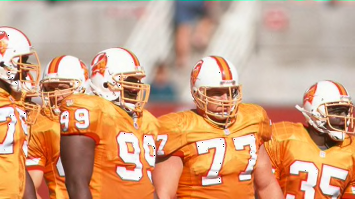
From the franchise’ inaugural season in 1976-1996, the Buccaneers had “Bucco Bruce” as their logo and a creamsicle orange color scheme. Of course the franchise was one of the losing-est franchises in pro sports for most of that run, and a change in colors seemed to be an effort to officially usher in a new era under then-head coach Tony Dungy.
The Rams have made a strained (and multiple) effort to garner interest in their new logo. But it can and should be different for the Buccaneers. Bring back “Bruce” and the creamsicle-colored jerseys, and even in this uncertain economic time watch jersey sales (driven by Brady) really go through the roof. It’s just too easy.
