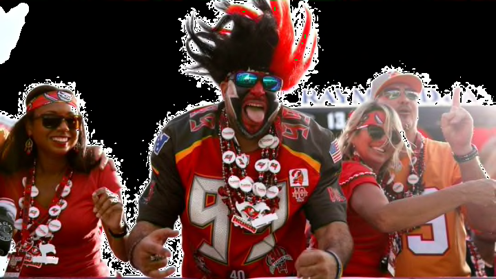
Buccaneers denied us creamsicle uniforms, but massively upgraded their look
By John Buhler

Even if the Tampa Bay Buccaneers denied us precious creamsicle with their new uniforms, these things look great and are a massive upgrade of what they had.
It’s a new era for the Tampa Bay Buccaneers, which means it’s time for some new uniforms.
The Buccaneers are one of seven teams who will tweak their threads this offseason. After having arguably the worst uniforms in the NFL since 2014, Tampa Bay opted to go for a cleaner, less frightening look over their awful alarm clock digits. No longer will you feel like you’re watching an episode of 24 when you watch the Buccaneers on fall Sundays.
Though they denied the world of our precious and beloved creamsicle as a primary color, the Buccaneers come out of this uniform reveal looking like offseason champions. Since the Buccaneers haven’t won anything in a very long time, it’s good to see them continue to build on the positive momentum from the Tom Brady free agency acquisition.
Here’s what the Buccaneers will be wearing for the foreseeable future.
Allow us to show you the future 😏#GoBucs pic.twitter.com/naURTtwkZ3
— Tampa Bay Buccaneers (@Buccaneers) April 7, 2020
Tampa Bay gave us three crisp and clean-looking uniforms with numbers on them that won’t make you want to gouge your eyes out with a rusty spoon. Their new home threads resemble the glory days of Buccaneer football with crimson tops and pewter bottoms. One look at them and you begin reminiscing over all the superstars from the iconic Tampa 2 defense of the early 2000s.
Though it’s hard to get excited about your typical white road uniforms, these are something Buccaneers fans should be proud of. Even if they don’t fly off the shelf, they’re not offensive to look at, so that’s a huge plus for the Buccaneers, especially given where they’re coming from in terms of an aesthetic standpoint.
Finally, the Buccaneers did something really cool. Never before has a team really tapped into the pewter market, but the all-pewter look is incredible. It takes the Jacksonville Jaguars’ cat vomit mustard yellow Color Rush jerseys to the woodshed. Though they are a tad unorthodox for a primary jersey color, the new Buccaneer threads pull it off marvelously.
Next: NFL uniform power rankings
With several other uniform reveals scheduled in the coming weeks, the Buccaneers set the tone for what a jersey change should look like. Tampa Bay was able to honor its roots by hitting the pewter hard with the occasional creamsicle accent. Though they didn’t give us the creamsicle uniforms our souls craved, we should be proud of the job the Buccaneers organization did here.