The NHL has a vast history of unique jerseys that have since been retired by their teams, but which ones should come out of the vault for another run?
Hockey jerseys are considered sacred by fans. While some are vehemently despised by a fanbase, many others are revered in the halls of NHL history. A large portion of those have since been retired by a team over the years, as teams continue to evolve and shape their brand for a modern audience.
Of course, some teams — such as the Toronto Maple Leafs and Montreal Canadiens — have stayed consistent in their look over the years. But others have had truly unique sweaters that have since gone by the wayside for one reason or another.
Since the pausing of sports has driven nearly every person online insane with the lack of something to do, I took it upon myself to take a look at one sweater from each NHL team that should be brought back. The Vegas Golden Knights are, of course, exempt from this exercise, since they have just one jersey to speak of in their franchise history.
With that out of the way, here is one retired jersey from 30 NHL teams that should be brought back and given another chance to shine.

Anaheim Ducks: 1993-95 jersey
All hail the eggplant jerseys of the Mighty Ducks from their inaugural season. I much prefer the prototypical 1990s look of this Ducks logo than the webbed duck foot of their current iteration. Plus, you can never have too much purple on a jersey.

Arizona Coyotes: 1999-2003 alternate jersey
I love the Coyotes black kachina jersey as much as the rest, and it’s great that the team has made it their official third jersey since 2018. Would love to see the bigger coyote head jersey get some love from the team, especially given how unique the lower third desert landscape motif is.

Boston Bruins: 2008-16 alternate jersey
The Bruins sweaters remain some of the most iconic in the NHL to this day. While they’ve hardly changed over the years, I’d love to see Boston go to an alternate jersey that isn’t just the letter B in a different font.

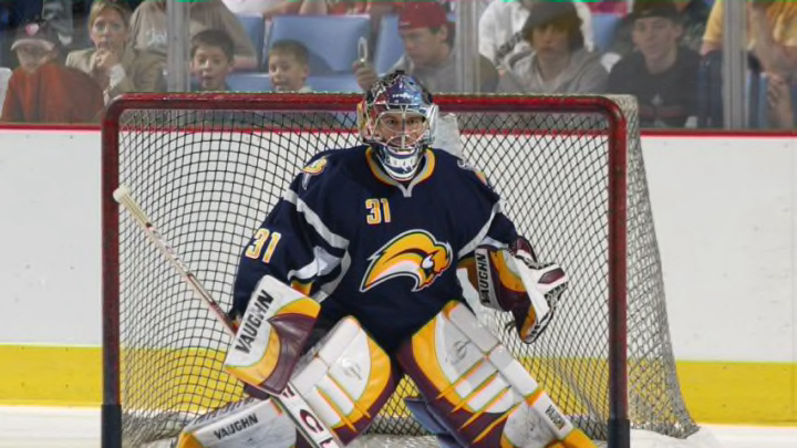
Buffalo Sabres: 2006-08 Buffaslug jersey
I love the buffaslug. The Sabres retired the wildly disliked jersey after 2010, but it’s due for a comeback. It’s been 10 years, Buffalo. Embrace the weird. Bring it back as an alternate for a few games next season.

Calgary Flames: 1998-06 Flaming Horse alternate jersey
There’s nothing in the NHL that looks like the Flames’ old flaming horse logo. Does it look like a minor league logo or one straight out of the XFL? Sure, but it has charm and is a nice change of pace from the Flames’ current lineup of C logos.
