The AFC is loaded with timeless uniforms, and our NFL power rankings break them down.
If you have nothing nice to say, don’t say it at all. We’re moving on.
Tennessee’s logo has always been a miss, and the blue helmet is just far too much of one color.
The Bengals have a ton going on. They’ve either been very bland “BENGALS” or they’re wearing 100 stripes of varying sizes.
New England modified its uniform this spring. Frankly, if Pat Patriot isn’t involved, miss us with it.
Get back to the ’80s look with Dan Marino. Hell, give us a Miami Vice alternate with some bright pink tones.
The recent overhaul was a downgrade, but the green and white is a solid scheme. It’s the saving grace here.
The colors are good. Other than that, nothing good or bad to say here. Bland.
The current duds are fine, but the 1980s-era uniforms were perfect. Bring back the old helmet logo, please.
Baltimore has largely had the same look for the past 20 years, and it’s a good one. Nothing incredible about it, but the uniform is sleek.
Going to the white helmets was the right call. Now, we get the “standing buffalo,” and this ranking shoots towards the top.
The Browns going back to a simple uniform is the right play. The last iteration was far too busy. It essentially tried too hard.
The Colts tweaked their uniforms this spring and added a new wordmark, but it’s a great, timeless uniform from Baltimore to Indianapolis.
Another team that hasn’t changed anything. The Chiefs have a great color scheme and a fantastic logo. It’s a perfect set.
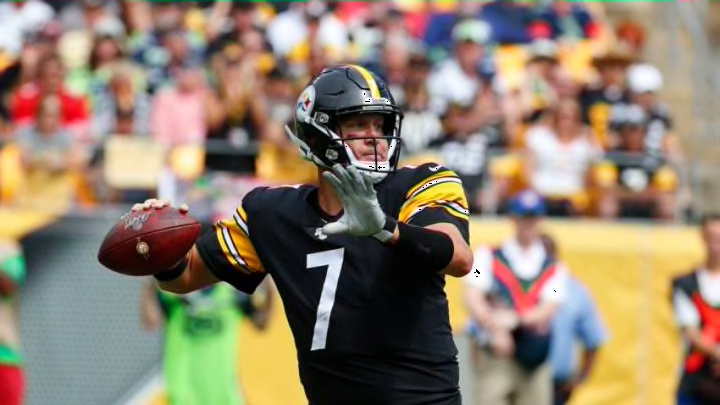
Between the colors, logo and history behind it, the Steelers have a uniform they should never change.
The silver and black is a classic kit. Oakland, Los Angeles or Las Vegas, it travels beautifully.
Just a phenomenal uniform. The recent update shoots the Chargers to the top of this list. Powder blue for life.
