Which NFC team has the best uniform? We break it all down here.
The new uniforms are a disaster. Everyone has their aversions typically to recent change, but the horn isn’t even a true horn anymore. A total mess.
There’s just too much going on. The logo is fine, but the striping and nameplates are far too busy.
The redesign could have made things awesome. Go retro, go cleaner. Nope, a damn gradient.
Nothing horrible here, but nothing which pops, either. Just a bland, forgettable look.
The black tops and the dark green is hideous. The best Eagles look was during the Randall Cunningham era.
We’re still low on the list with Tampa Bay, but the Bucs would have ranked dead last with that alarm clock ugliness. Give me the Creamsicles.
Go back to the silver helmet. When these got an overhaul a decade or so ago, it went the wrong direction. Too much nonsense.
The Vikings rank ninth, but they have a great uniform. Nice colors, mostly the same throughout the years. No qualms here.
New York did well to bring back the white pants. Now go GIANTS on the helmet and we’re in business.
The Lions could stand to turn back the clock to the ’90s era (both for uniforms and level of play) but the Honolulu blue is a great shade.
The Redskins went through a bunch of iterations early, but the burgundy and gold is a great combination. Now, change the name…
The Fleur-de-Lis is a classic symbol, and while the all-black pants should be shot into the sun, the rest of the look is solid.
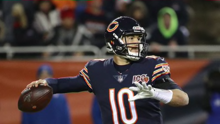
The Bears have an homage to George Halas on the sleeve, the iconic “c” on the helmet and great colors.
Great look. Thankfully they ditched the Frank Gore-era look. Simple, sleek.
No uniform in sports is more recognizable than the Cowboys. America’s Team.
An iconic look virtually unchanged since the 1960s. The green and gold has stood the test of time.
