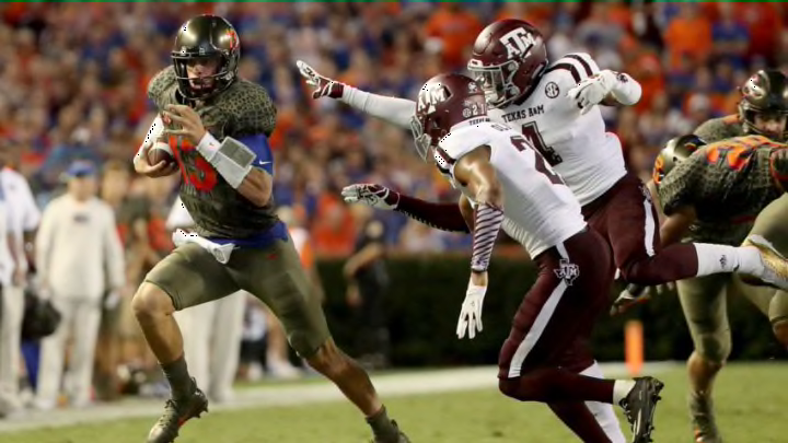
3. Florida Gators 2017 Alternate
“Florida man wears gator skin while playing in a college football game” is probably the most appropriate and most Floridian headline this uniform can have.
Okay, people, the point of mascots and logos are to show off your team’s nickname. There is no need to dress like the animal in itself. And now, my favorite complementary colors are blue and orange, so teams like the Florida Gators and the Boise State Broncos have some of my favorite uniform designs. But my word, what were you thinking Nike when designing this uniform?
But to be honest, the Gators somewhere along the line approved of this design. I mean it is pretty self-evident why this uniform is on the list. It looks exactly like alligator skin but it looks like something that should not be worn on a football field. And the helmet does not go with it as well. Not as much of a critique on the helmet had it been the lighter gray, as opposed to the darker gray. It would also look better if the logo would have been in the traditional colors to make the helmet pop.
I really cannot think of a school that would be able to pull this look off. Imagine Alabama having a uniform looking like an elephant’s skin? Or South Carolina looking like a rooster? If this became a trend, PETA would be protesting at every college football game.
The University of Florida, how dare you disrespect Steve Irwin like this? Leave these types of uniforms for minor league baseball.
