The NBA’s City Edition jerseys have been hit or miss.
Unveiling a new NBA jersey is equal parts exciting and nerve-racking. While it’s cool to see some of the fresh new threads teams will unveil, it also becomes painfully obvious which teams tried to do too much and came up with some of the worst-looking uniform combinations we’ve ever seen.
Based on some early leaks of the 2020-21 City Edition jerseys, it’s clear that some teams knocked it out of the park while some failed epically when it came to putting a good look together.
The Good: Los Angeles Lakers, Phoenix Suns, Brooklyn Nets, Miami Heat, Golden State Warriors
New City Edition for Lakers? pic.twitter.com/UGZZWnwWDd
— Mike Luciano (@ByMikeLuciano) October 30, 2020
The Lakers deserve exemplary marks for their uni combinations, as it harkens back to the old blue and white days from the franchises’ origin in Minneapolis. While not a straight-up throwback like they’ve worn in the past, the silver numbers and blue lettering really pop, and it’s a nice change of pace from trying to create new purple and gold combinations like they did in the last two years.
The Suns 2021 “City” jersey has been leaked. (via @camisasdanba)
— Legion Hoops (@LegionHoops) October 29, 2020
Thoughts? pic.twitter.com/iFyYOz9Xi4
These are going to be divisive, but it just screams Arizona in the most awesome way. All-black Suns jerseys have typically been a hit in years’ past, and the blocky red, orange, and yellow give this jersey a nice Southwest flair. “The Valley” might not be the best move, but this still looks pretty sharp.
https://twitter.com/_insidethepaint/status/1321577067821985792
You will either love or hate these Nets jerseys. While the handwritten city and team name, as well as the multicolor splatter on the trim, will cause some to hold their nose, this jersey is actually a tribute to Brooklyn-born artist Jean-Michel Basquait. Between this and the 90s New Jersey throwback, the Nets are adding some color to their monochromatic wardrobe, even if it comes at the expense of the coogi trim uniform.
https://twitter.com/TheNBACentral/status/1322219893287256066/photo/1
Miami decided to lean into the bright blue and neon pink of their downtown nightlife, and it has given us some of the most iconic alternate jerseys in recent NBA history. Rather than reinventing the wheel and fixing what isn’t broke, the Heat broke out another bright blue third jersey, and it instantly shot to the top of the charts.
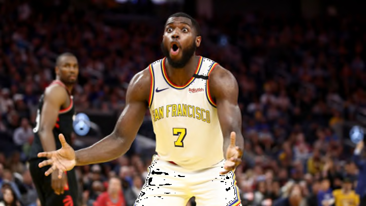
Golden State is going to be extremely polarizing this year. The navy blue paired with the gold trim is reminiscent of the Don Nelson “We Believe” days, but the words “Oakland” across the front seem a bit weird considering the Warriors play in San Francisco now. These are pretty sharp but not as good as their San Francisco throwbacks from last year.
The Bad: Dallas Mavericks, Portland Trail Blazers, San Antonio Spurs
The Mavericks 2021 “City” jerseys have been leaked, via @sga4mvp.
— Legion Hoops (@LegionHoops) October 29, 2020
Thoughts? pic.twitter.com/pVoWPsu5LA
In a vacuum, these jerseys look pretty good, as the gold team name and silver lettering with a gold trim oozes luxury. However, the Mavericks have a sharp blue and silver color scheme, and ditching it almost entirely isn’t a very wise move. Still, it’s better than last year’s atrocity.
https://twitter.com/addicted2helmet/status/1321906595715010560
Yes, Portland is in Oregon, but ditching a city with such a unique, vibrant place in the American cultural lexicon to align yourself with the rest of the state is a puzzling choice. Outside of the solid gray jersey and tiny splash of blue giving off a Pacific Northwest vibe, there isn’t much to write home about. The stripe down the side is a major strike against this combo.
FIRST LOOK: Apparent leak of Spurs' new City alternate. Legitimacy not yet confirmed. (h/t @sga4mvp) pic.twitter.com/vSbcweSgRn
— Paul Lukas (@UniWatch) October 30, 2020
San Antonio fans might’ve thought it would be hard to do much creatively with a black and white uniform, but they managed to at least come up with a somewhat cool city uniform. Bringing back the old Spurs’ secondary colors looks nice, but putting them in a big stripe across the middle feels like wasted potential.
The Ugly: New Orleans Pelicans
New Orleans Pelicans 2020-21 City Edition Jersey leaked onlinehttps://t.co/UJDS4fnJgr
— Uncommon Jerseys (@UncommonJerseys) October 29, 2020
Shoutout @11_kevin_ for the tip! pic.twitter.com/2x3LpJxz0W
Oh dear, we have a stinker here. These jerseys are supposed to be based on the city flag of New Orleans, showing that the team is trying desperately to mimic the Chicago Bulls’ city flag jerseys. In practice, however, it’s a mess. With three barely visible fleur de lis, the ghastly blue and red trims on the top and bottom of the jersey, and what appears to be Times New Roman number font, this is a mess from start to finish.
