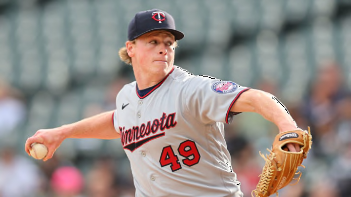
The Minnesota Twins will start off the 2023 season with a re-designed logo, which is certainly gaining the attention of many MLB fans.
The Minnesota Twins unleashed a new logo re-design on Friday with brand-new home and road uniforms, as well as two alternates.
Inspired by the past. Built for the future. #AllTwins https://t.co/EdCBQ5n2ki pic.twitter.com/AiNNVXVW3t
— Minnesota Twins (@Twins) November 18, 2022
The uniforms haven’t been updated since the 2010s, so it’s an exciting new change for fans as another season will be here sooner than we know it. Some fans love the changes, while others aren’t quite ready to part with the old uniforms. The Twins published the changes to their website with a short description of the meaning behind each, which may help hype fans up.
Regardless, people are noticing and speaking about the new uniforms.
Best memes and Tweets about the Minnesota Twins new uniforms
Of course, there are mixed reactions to the uniforms. Some people don’t mind change, while others simply dislike it.
Some fans, however, are seeing similarities to other teams uniforms, particularly the Miami Marlins.
That M logo looks very similar to the Marlins M
— DORIAN (@daysofthecastle) November 18, 2022
M hats giving me this vibe pic.twitter.com/5Z3RvhpCG6
— c c skaret (@CCskaret) November 18, 2022
The “M” hats just don’t seem to be a big hit among fans as several have expressed dislike for them.
Jerseys look great, but the M logo hats are stink
— nate (@dubetube95) November 18, 2022
Don't care for the M logos. I like the home and the Twin Cities uniforms.
— JPacalyse (@jlanky1978) November 18, 2022
One fan shared their ideal look of the uniforms and did a great job at re-creating the look for the team.
much better pic.twitter.com/uvvXv9fo7T
— zach (@zachleft) November 18, 2022
Dear lord those M caps are embarrassing. Blue jerseys kinda suck, road greys are beautiful. Twin Cities look is cool, home whites should’ve had red numbers. Did I mention the M caps suck as hard as something can suck?
— Ian (@Canad__Ian) November 18, 2022
There’s pure dislike from several fans, but there are also many who enjoy the new uniforms and the hardly-changed logo.
Uniforms are fire but the logo didn’t change
— Carlos Rodon fan (@YankeesStats_) November 18, 2022
They are beautiful. Those away pinstripes are gorgeous
— noah (@noah236_) November 18, 2022
One fan was rightfully more concerned about the Twins’ roster rather than the uniforms next season, which is truly a much bigger issue.
Can the new uniforms pitch? Recycling uniforms and coaches every few years doesn't change the stagnant product you put on the field every year.
— Tommy Johnson (@Dirt43) November 18, 2022
The Twins haven’t had much success recently, missing the playoffs every season since 2020 and certainly not looking like favorites to make it far into the postseason any time soon. They certainly need roster construction, and the uniforms won’t do much for them there. Hopefully they’ll at least inspire some sort of change.
