What’s the deal with that colorful Super Bowl 57 logo that’s being used for the big game this year?
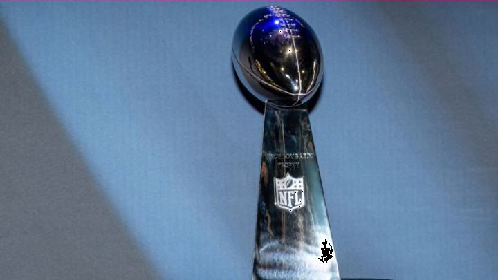
The Super Bowl logo, what’s up with it? The final iteration of this year’s NFL Playoffs, the Super Bowl 57 logo features the Roman Numerals (LVII) for the game with the Lombardi Trophy in the middle. But it also has some blue and magenta/orange silhouettes that, if you look closely, you’ll see are mountains.
Here’s the full history of the Super Bowl logo and some inspiration and backstory for this year’s logo.
History of the Super Bowl logo
If you take a look at the entire history of Super Bowl logos, you’ll find that the 2010s took on a regrettable theme that has even been referred to as ‘corporate’. Is there a worse word for something that is supposed to be a piece of art?
The logos in that period were all the same, silver logo featuring the roman numerals for that year’s game (with the exception of Super Bowl 50) and the Lombardi trophy.
The #SuperBowl logo has become less creative, and more corporate throughout the years. pic.twitter.com/VOIG4bLswO
— The Sporting News (@sportingnews) February 6, 2021
If your team won one of those years, the logo imprinted on the celebratory merch was simply not memorable or anything that would invoke too much nostalgia for the big game. That’s no fun!
The first five years of logos or so resemble something out of a PowerPoint Word Art plugin. Then, it starts looking like the text graphic on the front of Final Fantasy or some other similar video game.
Starting at XVII, the logos hit their stride. They were still largely red and blue but were larger and had a nice artistic flair each year. Then, around XXVII, the logos started to feature elements of the host city or stadium. They had new colors each year depending on that year’s motif and were larger and more beautiful.
That happened until Super Bowl XL. From there, the logos used were still different each year but didn’t quite feature characteristics of the location of the game itself. They started to trend toward boring until that corporate feel really locked in.
Well, LVI brought that “locality-inspired motif” back to the logos, and that’s where Super Bowl 57 (LVII) gets its inspiration from.
It’s a far cry from those awesome 90s-era Super Bowl logos, but we’re moving in the right direction these days.
Super Bowl 57 logo inspiration, backstory
This year’s game is being played in Arizona, so the logo takes inspiration from southwestern themes.
Chris Stackhouse NFL’S Senior Director of Creative Design, said, “This year’s Super Bowl logo takes the roman numerals and really creates a window that showcases the awesome, beautiful landscape of Arizona.”
He also had this to say to AZFamily:
"“The Super Bowl logo is like a time capsule. It says something about that place and what’s so creative and vibrant about where our Super Bowl is lucky enough to be hosted,” Stackhouse said. “There’s so much rich visual, cultural, and artistic history to tell. That’s something we really wanted to celebrate and bring to life through the art and through the storytelling through some really exciting collaborations and partnerships that are going to be part of the Super Bowl in Arizona.”"
There you have it. Picture the Arizona sunset when you see the logo!
