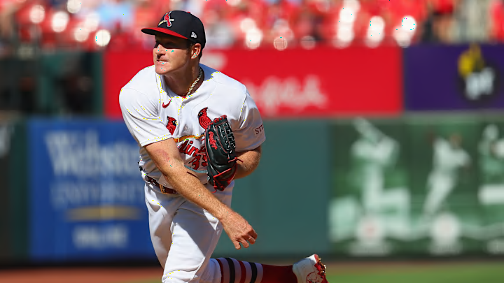
[Ed. Note — The initial publication of this article incorrectly stated that Nike had been producing MLB's jerseys since 2020 until this year. Fanatics has been and remains the production partner of the jerseys since 2020, with Nike handling design and development, according to the league's press release upon the partnership's inception in 2019. The partnership lasts through 2030.]
This year's new MLB jerseys haven't exactly been met with rave reviews. The designs aren't popular with the players.
The St. Louis Cardinals are currently dealing with the situation, and they have already had several players speak out against the new template, including star right-hand starting pitcher Miles Mikolas.
On Twitter, Cardinals insider Jeff Jones for the Belleville News-Democract posted a picture of Mikolas' jersey to show an example of the new template, while also summing up exactly why players around the game are unhappy and want a little something different.
To be very clear: this is not a Cardinals decision. This is the result of Fanatics being in charge of production this year for the first time. Nike is licensing their logos. Every team will be going through this.
— Jeff Jones (@jmjones) February 13, 2024
Cardinals players blast Fanatics over new uniforms
As you can see, the font is much smaller. But the slight adjustments to the front of the jerseys have left the players uncomfortable. Mikolas blasted the 2024 Nike-designed and Fanatics-produced jerseys not fitting right, the pants being too short, and the fabric being uncomfortable.
"They look cheap," said another player.
Fanatics has handled production of the jerseys since 2020, with Nike handling the design and development, according to the partnership announcement in 2020. The partnership will last for 10 years, with six left.
As of now, the 2024 iteration of jerseys is getting mixed reviews. Mikolas's negativity is shared by some, but other players had positive remarks about the breathability of the new iteration in Nike's press release announcing the new jerseys.
The jersey placket is much narrower in the new template, and Paul Lukas of Uni Watch showed several examples of the new style in a recent article, including the Cardinals. The jerseys do not look very flattering for the Cardinals, as the logo on the front of the jersey seems lazily stitched together, and with the jersey pocket being narrower, the space between the "R" and "D" in "Cardinals" have too much space in between each other.
This is an issue that all teams are dealing with, and early on in the game, these jerseys have not received high marks from the players. The only team that appears to have done it right is the San Francisco Giants as Lukas points out in the article linked above.
Fanatics hasn't exactly endeared themselves to the fans, with many complaining of poor quality clothing and uneven designs on jerseys and shirts. Now, players are vocal about how bad the quality is on their uniforms based on Nike's design and development.
But it's clear that among Cardinals players, the new design is not popular for various reasons, and it will be interesting to see if over the course of the new season the players demand something different.
