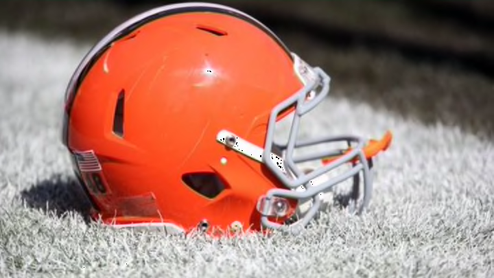
Cleveland Browns fans seem to be a little more than disappointed with the new logo which is anything but different.
More from Cleveland Browns
- Browns release 2022 draft pick after allegations he threatened a woman
- Browns wave white flag against the Steelers months ahead of time
- NFL Power Rankings: Who is the best quarterback in each division?
- NFL Power Rankings: Which teams will have the best rushing attacks this season?
- NFL rumors: DeAndre Hopkins reunion with former quarterback off the table
After months of speculation, the Cleveland Browns finally released their new logo to fans this morning. There was months of guessing and fans speculating what the new logo might be, but it turns out we all got our hopes up for absolutely nothing.
Some fans wondered would the franchise go back to the Elf, some wondered would it be something completely different in order to shake things up. One thing we forgot though that this is the Browns we’re talking about, so imagination goes out the window.
The geniuses behind the logo reveal decided to cause so much hype and publicity over what amounted to be nothing more than a different shade of brown.

Yep, that’s all.
The new logo is the exact same as the old one, just a little darker. I guess it was a clever marketing scheme to get everyone talking about the team again, and it’s clearly worked because look what you and I are doing. They did however update the ‘Dawg Pound’ logo, but that’s not enough for the fans who were expecting a new logo to feature on the helmet.
Needless to say, fans on Twitter have reacted in fantastic fashion to the incredibly underwhelming new Cleveland Browns’ logo.
The @Browns logo unveil has to be one of the most disappointing hypes ever. I barely notice the change at all #whataflop
— Rhys Lewis (@RhysDLewis) February 24, 2015
The Browns logo change got me all hyped and all they do is change the shade of orange.. 😂
— Tyler Lunsford (@Tlunz5) February 24, 2015
New Browns logo: another example of Cleveland FAIL!
— TinkEsq (@TinkEsq) February 24, 2015
The Browns 'new' logo is just a different shade of orange so that's a huge disappointment
— Mike Raymond (@m_ray81) February 24, 2015
The funny thing about the Browns logo is that if they made radical changes people would have hated it because people hate everything.
— Mike Cole (@MikeColeNESN) February 24, 2015
But only one tweet perfectly summed up the entire thud that this logo reveal ended up being:
More from FanSided
- Joe Burrow owes Justin Herbert a thank you note after new contract
- Chiefs gamble at wide receiver could already be biting them back
- Braves-Red Sox start time: Braves rain delay in Boston on July 25
- Yankees: Aaron Boone gives optimistic return date for Aaron Judge
- MLB Rumors: Yankees-Phillies trade showdown, Mariners swoop, India goes to Seattle
