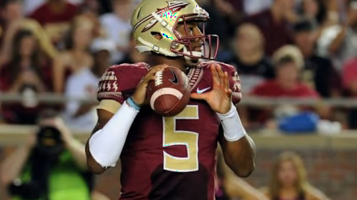
If you’ve watched any Florida State games so far this year, you might be perplexed as to where the team actually is. It’s not that they’re playing all that bad, but thanks to a lame redesign by Nike, the iconic Seminoles logo and colors were unrecognizable in the teams first few games.
More from College Football
- Jim Harbaugh facing 4-game suspension over NCAA violations
- College football neutral site games in 2023: Full list
- College GameDay announces surprise Week 1 destination
- College football analyst warns Oklahoma that Texas is doing better prep for SEC
- College Football Playoff national championship game locations for 2024, 2025 and beyond
The helmet color was off, the uniforms didn’t look right and the redesign couldn’t have failed more than it did. Thankfully, the university and Nike have backpedaled on the change and are moving back to the more traditional colors.
A photo of the new helmet design and color comes from Lost Letterman, who point out it took far too long for the changes to be made.

The difference is rather stunning as the old Florida State colors are well defined and even more so engrained in out minds. Whatever that is on the helmet pictured left is just gross and could be further from what the Seminoles have always rolled with. Moving back to the more traditional look will please fans but it’s not going to totally wash the bitter taste out of our mouths or repair our sight after having to see the weird yellow-ish Florida State helmets for far longer than we should have.

No more, Florida State faithful, no more.
More from FanSided
Madden 15: Week 3 simulations and predictions
Is Todd Gurley destined to be an NFL star?
College Football Week 4 preview and predictions
NFL Armchair quarterback guide to Week 3
