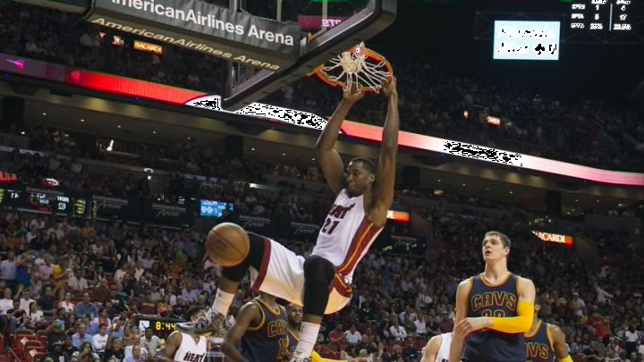
Scoring efficiency is often difficult to compare player-to-player, because there are so many variables involved. Different players shoot from different locations, against different defenders, at different frequencies, and under different game conditions. While it’s factually correct to say that Hassan Whiteside’s 61.9 true shooting percentage last season made him a more efficient scorer than Russell Westbrook and his 53.6 true shooting percentage, that’s really not an apples to apples comparison.
There are lots of different ways of parsing the variables to make for more detailed comparisons, but some measure of usage is probably the most common, as usage implies a great many things about shot locations and defensive attention. However, I thought it would be interesting to try and weave some of the SportVU possession data into this question, looking specifically at half court touches. The NBA’s SportVU player tracking statistics page lists half court touches and points scored per half court touch for each player.
Obviously, those two things are incredibly intertwined. Not every touch is a scoring opportunity and players who handle the ball a lot will have a much lower ratio of points to touches because of their responsibilities for initiating the offense. For example, Pau Gasol and Derrick Rose had nearly identical per game scoring averages last season–18.5 to 17.7. However, Rose averaged nearly 30 more half court touches per game than Gasol which makes comparing their points per half court touch futile.
If we graph the entire league, we can see that the relationship between touch frequency and scoring per touch is fairly strong.

The more often a player touches the ball, the lower their ratio of points to touches is. We can use this relationship to project a player’s expected points per touch ratio, given how often they touch the ball. For example, Bradley Beal averaged 1.48 half court touches per minute last season. At that frequency we would expect him to be a player who scores 0.319 points per half court touch. As it works out, that is almost identical to his actual average from last season of 0.322.
Essentially what we’re doing is using a player’s offensive involvement (measured by touches) to project how frequently we would expect them to score. Beal is a player who matches his projection almost exactly, but many players differ and in those differences we can see the players who are much more or less efficient than we would expect. The graph below takes each player’s differential–the difference between their projected points per half court touch and their actual points per half court touch–and graphs it against their touch frequency.
The y-axis shows the points per half court touch differential (positive means more efficient than we would expect, negative means less efficient). The x-axis shows half court touches per minute. The colors on the graph sort everyone into one of four groups, based on their efficiency and touch frequency[1. I separated high and low usage here at 1.5 half court touches per minute because it seemed to be a natural splitting point between primary ball handlers and everyone else].
What you can see is that, true shooting percentages aside, Hassan Whiteside and Russell Westbrook are both insanely efficient given how often they are involved in their teams’ offenses. Each player leads their grouping in points per half court touch differential, and by a huge margin. On the other end of the spectrum you can see players like Andre Roberson and Joakim Noah, in the low usage group, and Dante Exum and Matthew Dellavedova, in the high usage group, who scored far less frequently than we would expect.
This method still doesn’t create a perfectly level playing field for comparing scoring efficiency. Comparing Westbrook to Whiteside is still not quite apples to apples (let’s say apples to pears) and neither is an in-group comparison like Westbrook to Austin Rivers. But it still provides a slightly more informed understanding of what each player is producing with the opportunities they have.
