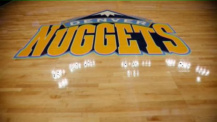
The Denver Nuggets have ended their offseason by releasing an awesome new home court design.
In an offseason that has seen teams all around the NBA adopt a new look, from the disappointing Los Angeles Clippers jerseys to the widely praised Milwaukee Bucks uniform and logo, the Denver Nuggets have now joined in with their new home court design.
After using a relatively simple design based around their primary team color under the basket with an emblem at center court, the Nuggets have now revamped Pepsi Center with a totally new look.
As you can see for yourself after the release of the design on the team’s official Twitter account, it’s a definite upgrade:
Ooooooh we have a new court design this year!
— Denver Nuggets (@nuggets) September 24, 2015
Details: http://t.co/H2VAHtbSfN #Nuggets pic.twitter.com/RPS3g0faKM
The slightly faded prints of the pickaxes and mountain crop at the sideline are a great touch to the bold logo at center court. It’s an interesting idea to let the pickaxes fill the the key but it certainly pays off, as the use of a light grey means the emblems aren’t too overbearing whilst still showing off the team’s identity.
Essentially, they created a bold look without making a design that’s so in-your-face you want to squint after looking at the court for too long.
Which, sadly for Clippers fans, is the opposite of this if you aren’t one for garish designs:
Early look at the Clippers' home court for next season!#ClippersNation pic.twitter.com/0EXqkm3S1a
— Clippers Nation (@ClipperNationCP) July 17, 2015
It’s not as though the Clippers’ new home court is terrible, and the black around the edges looks rather slick, it’s just the logo and the blue semi circles and red strips in the lane that look as though they were blocks filled in by a designer on a 2007 version of Windows “Paint” that are the problem.
In terms of the new home court design, though, it’s clear that the Nuggets have won. With a solid logo supported by clear emblems to create an attractive design and represent the history of the team, the Nuggets have done a great job.
Thankfully Denver fans don’t have too long to wait until they see new players such as Emmanuel Mudiay in action on their new home court.
More from Denver Nuggets
- Predicting NBA’s Christmas Day Schedule: Lakers, Warriors highlight slate of postseason rematches
- Bruce Brown takes shot at Lakers, LeBron James after cashing in
- The new NBA flopping rules explained
- NBA Free Agency: Pacers overpaid to add Bruce Brown, but that’s okay
- NBA rumors: Surprise team in the East could end up signing Bruce Brown
