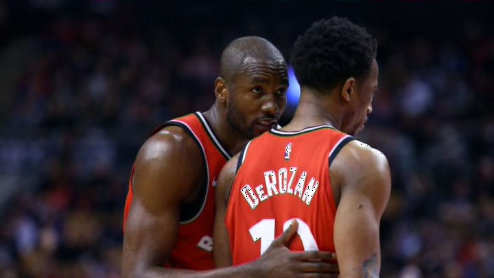
One of the most persistent stories in the NBA this year has been the development and evolution of the Toronto Raptors. They are currently averaging 113.8 points per 100 possessions, the best mark in franchise history by a point-and-a-half. They’ve raised their offensive ceiling by moving the ball more, taking more 3-pointers, and relying less on the individual creation abilities of DeMar DeRozan and Kyle Lowry.
It’s created a team that looks it could be the class of the Eastern Conference and a dark horse championship contender. Defensive improvement has played a big part in their surge but the change in their offensive style has been the most visceral adaptation. In December, Daniel Levitt looked at this stylistic change for 538 but with two-thirds of the season behind us, I thought it might be interesting to use my offensive style charts to check in on the Raptors and the rest of the league.
These charts are not meant to evaluate whether an offense is good or bad. They are designed to help illustrate how teams go about the goal of trying to put the ball in the basket. Each team’s offense is evaluated on four stylistic spectrums.
Ball movement is measured with the average touch time for each team, from the NBA’s player tracking statistics. A lower average touch time means the ball is moving from player to player more quickly.
Player movement is measured with a combination different NBA.com tracking statistics, and works out to average distance traveled per 24 seconds of offensive possession.
Pace is measured with the average length of an offensive possession from Inpredictable, a more accurate representation for how quickly a team is working than traditional pace.
Shot selection is measured with MoreyBall percentage — in this case the percentage of a team’s true shooting opportunities that came at the rim, from the free throw line, or on a 3-pointer. It’s a generalized measure but captures something about how much each team hews to the shots that are, on average, the most efficient.
On the graphs below you’ll see a line for each team’s offense, both this season and last season. As the line moves away from the center of the graph on each axis you’re seeing more of that stylistic trait. For example, shot selection shows a (hypothetically) more efficient shot selection the further you are from center. Here’s how the evolution of the Raptors looks.

By the aggregate change in percentile rank in the four categories, the Raptors have indeed undergone the biggest stylistic change in the NBA this season — followed closely by the Los Angeles Clippers adjusting to life without Chris Paul. In facepalmingly unsurprising news, the Knicks are the team that has undergone the least style change this season.
As always, it’s worth looking at the best offenses in the league for a reminder that style and success are not necessarily the same thing.

The best offenses in the NBA all use very different styles. The Raptors are most similar to the Warriors in style but play at a slightly slower pace and use a lot less ball movement, perhaps the residual effects of DeMar DeRozan’s isolations.
Next: Nylon Calculus -- Who is the best LeBron-stopper in the NBA?
The Cavaliers sit somewhere in between. The Timberwolves look like nobody else, a testament to their ability to draw free throws and the shot-making abilities of Karl-Anthony Towns and Jimmy Butler. The Rockets still use pace-and-space to the extreme but the addition of Chris Paul to James Harden in the backcourt has meant a lot less movement around the possessions.
Below you can find charts for the rest of the league.


Again, these charts don’t necessarily illustrate good or bad offensive tendencies. But they can help us understand how personnel changes and coaching philosophies are manifesting strategically on the court.
