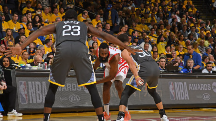
Introducing triple-threat charts, which visualize a team’s propensity for dribbling, shooting and passing from different locations.
Earlier this week Nylon Calculus contributor Senthil Natarajan had a fantastic idea for a new basketball chart. He suggested mapping players’ dribble-pass-shoot tendencies by court location, something we might call a triple-threat chart. I had some fun experimenting with this idea using a playoff game between Golden State and Houston as a proof of concept.
You can go to the NBA site and find stats that compile every touch from every game, sorting out the dribbles from the passes and the first-touch shots. The league is tracking it all. Of course, they won’t let us see it. And sadly there’s no publicly-available tracking data that would allow us to make the triple-threat chart of our dreams. So, as a stand-in for that juicy tracking data, I created my own small dataset. I re-watched Game 6 of the Western Conference semifinals (or at least the parts that were included in the Playoff Playback episode that I found on my DVR) and logged every touch that was made in the frontcourt. In each instance, I jotted down where the player was standing when he caught the ball and what happened next: a dribble, a pass, or a shot. I recorded 107 front-court touches for the Warriors; they looked like this:

In the same contest, the Rockets had far fewer front-court touches, just 61. This large touch discrepancy reflects the contrast between the Warriors’ dynamic ball-movement offense and the Rockets’ more static approach. In Game 6, the Warriors made 325 passes, which was about 50 percent more than the Rockets’ 219. And one thing that really stood out to me in tracking the front-court touches from this game was the number of zero-pass possessions Houston ran.

It’s informative to break down the touches by zone. I divided them up by the distance to the basket: in the paint, in the midrange, at the 3-point line, and beyond. In the table, you will notice Golden State’s tendency to initiate their offense with a string of passes well beyond the arc (18 times). In contrast, most of Houston’s possessions started with the ball in the hands of James Harden, sometimes followed by some more dribbling by somebody else. In all, the Rockets dribbled 230 more times than the Warriors in Game 6.
Nearly all of the first-touch shots attempted by both teams in this game were from the paint or from the 3-point line. Whereas the Warriors passed the ball into the post on occasion, the Rockets kept the midrange area absolutely pristine (just 2 touches at the free-throw line).

Another way to present the dribble-pass-shoot tendencies of the Houston and Golden State players in Game 6 is to use a contour plot (or an isopleth map). In this type of chart, the darkest areas represent the ones with the densest collection of touches. So then, a dark red spot shows a lot of dribble touches, a dark green splotch marks a bunch of swing passes, and a dark blue stain means there were some first-touch shots. Here’s the souped-up version of the Warriors’ Game 6 touch charts, with contours added:

Once we have the three contour maps we can mix the red, green, and blue areas together and see what happens! Because the Warriors had distinct hot spots for dribbles, passes, and shots in this sample, the color-mixed map is rewardingly psychedelic. The contour charts for the Rockets look more washed-out because they had fewer total touches:

But how could we use a triple-threat chart like this in practice? Well, I think they could be pretty useful for understanding tendencies of individual players (I would have liked to have plotted individuals rather than teams, but that would have meant a lot more manual tracking).
As a defender, you could look up where on the court your opponent tends to catch the ball and what he prefers to do once he gets the ball in a variety of locations. Do you really need to close out to challenge his above-break 3-pointer or is he just planning to pump fake and take a step towards the basket? From which spot is he most likely to initiate a drive to the basket? This information is already part of the scouting report in some form, but these charts could be another tool for communicating these types of individual defensive keys to players and coaches.
