
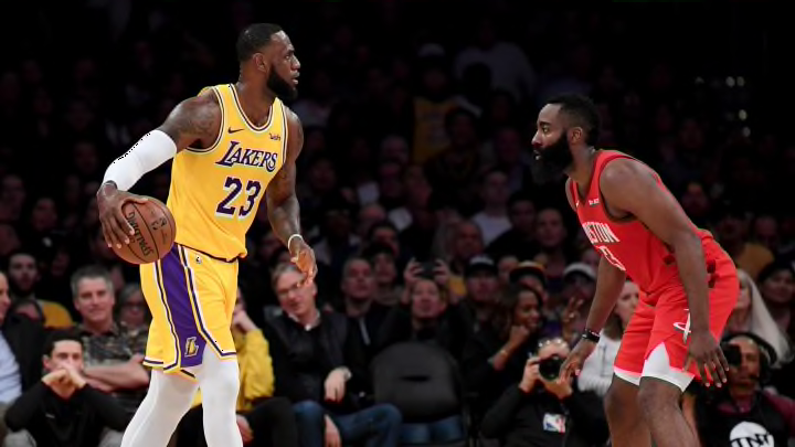
Teams like the Houston Rockets continue to push the outer edges of offensive style. But even in the conservative middle of the pack, things have changed.
It doesn’t take an analytics savant in an ascot to know that the NBA’s style of play has changed dramatically over the past few decades. Outliers like the Houston Rockets are always pushing the boundaries of what’s possible but even what’s considered a vanilla offense looks very different than it did just a few years ago.
For the past four seasons, we’ve used offensive style charts as a way of visualizing those different approaches teams use to try and create efficient offense. With this multi-season sample in hand, I thought it would be interesting to look at how much the norms of offensive style have moved.
As a reminder, these charts are not meant to evaluate whether an offense is good or bad. They are designed to help illustrate how teams go about the goal of trying to put the ball in the basket. Each team’s offense is evaluated on four stylistic spectrums.
Ball movement is measured with the average touch time for each team, from the NBA’s player tracking statistics. A lower average touch time means the ball is moving from player to player more quickly.
Player movement is measured with a combination of different NBA.com tracking statistics and works out to average distance traveled per 24 seconds of offensive possession.
Pace is measured with the average length of an offensive possession from Inpredictable, a more accurate representation of how quickly a team is working than traditional pace.
Shot selection is measured with MoreyBall percentage — in this case the percentage of a team’s true shooting opportunities that came at the rim, from the free-throw line, or on a 3-pointer. It’s a generalized measure but captures something about how much each team hews to the shots that are, on average, the most efficient.
On the graphs below you’ll see a line for each team’s offense. As the line moves away from the center of the graph on each axis you’re seeing more of that stylistic trait. For example, shot selection shows a (hypothetically) more efficient shot selection the further you are from the center. To refamiliarize yourself with these layouts, the graph below shows how the Milwaukee Bucks’ offensive style has changed from 2016-17, the first year I built these offensive style charts, to the present day.

Because each stylistic trait used on these charts exists on a different scale, I convert to percentile ranks for that particular season to make the layout cleaner and easier to work with. Usually I just the percentile ranks for a single season so you’re just seeing how the team’s implementation of each stylistic trait compares to other teams for that season. In the Bucks graphs above, and in all ensuing style charts for the rest of the piece, I’m using percentile ranks for the data set of all 30 teams for all of the four seasons we’re covering.
The graphs below show the spread of the 30 teams in each of the four stylistic traits, in each of the past four seasons, standardized by the overall percentile ranks.
There doesn’t appear to be any discernible pattern with regards to ball movement but the other three have seen a steady increase over the past four years. For example, the average pace in 2016-17 would be tied for 25th this season. The average MoreyBall percentage from that season would rank dead-last this season. The numbers for player movement may be affected by the increase in pace (player movement is measured in total traveled per 24 seconds of offensive possession but a decrease in pace means a greater share of each 24-second increment of the course of a season is spent moving from one end of the floor to the other) but it seems safe to say that there has been at least some growth on that end.
The graph below takes the percentile rank for the average each season (compared to the overall data set) in each trait and lays it out in the same format as the individual team style charts.

Here you can see just how dramatic the change has been in regards to pace, shot selection and player movement, with the caveat, again that the player movement figures are at least somewhat inflated by the surge in pace.
Establishing these norms and their progression over the past four years also lets us identify which teams have been most active in pushing the boundaries, and vice versa. The graph below shows the 2019-20 offenses that are most similar to the 2016-17 league averages.

Interestingly, the Pacers, 76ers and Nuggets all feature ball-dominant big men who get a lot of touches around the basket and the elbows. Even though Nikola Jokic and Domantas Sabonis are often working as facilitators the on-court geography of that structure seems to have a meaningful effect on style. The Thunder are obviously heavily influenced by the tendencies of Chris Paul, as stubborn a player as there is in the league and the Knicks…well, they’re the Knicks.
The graph below shows the 2019-20 offenses that are least similar to the 2016-17 league averages.

The Wizards, Timberwolves, Bucks and Pelicans are all similar in that they’re towards the extreme end in all four stylistic traits, although Bradley Beal’s mid-range jumpers have an effect on Washington’s shot selection. The Hawks were similar in terms of overall distance from average but they are extreme in their lack of ball of movement, a reflection of how much offensive creation responsibility Trae Young has.
Interestingly the Rockets, the team often held up as the exemplar of offensive experimentation are closer to the 2016-17 league averages than the five teams here. In terms of just pace and shot selection, no 2019-20 offense is further from those 2016-17 averages but with their shift away from pick-and-roll and back towards static spot-ups around isolations for James Harden and Russell Westbrook, their measures of player movement and ball-movement are very similar to the average offense from four seasons ago.
Perhaps this is just another Houston outlier. Or it could be a reminder that evolution is not linear and some of these stylistic traits may be prone to cyclical emphasis as defenses continue to adjust and offenses look for new advantages.