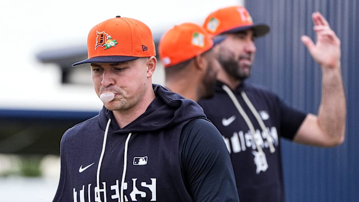
Spring Training has officially arrived, the first step on the long and winding road toward crowning a World Series champion in the fall. But before we get to any of that, we have some far more pressing business to attend to. Spring Training also brings with it new hats for all 30 teams (never underestimate MLB's ability to move merch), and those hats must be either roasted or praised.
The reveal finally came on Wednesday. Behold, the Grapefruit League:
So many 🔥 options to choose from!
— MLB (@MLB) February 11, 2026
Here are all of the Grapefruit League hats for Spring Training 😮💨 https://t.co/HJipa2oqNV pic.twitter.com/cEk5ZFRvup
And the Cactus League:
These @NewEraCap Spring Training hats are awesome 😍
— MLB (@MLB) February 11, 2026
Here is a look at all of this year's Cactus League caps! pic.twitter.com/x32PD6hBfD
The specific cactus and grapefruit iconography is new, as are the some of the logos and specific color schemes here. But which teams hit a home run, and which need to go back to the drawing board? Let's break it down.
The good
The grapefruit and cactus imagery
Credit where due here: MLB has not always had success coming up with Spring Training-specific iconography — the less said about those Interstate signs, the better — but I think they more or less knocked it out of the park (sorry) here. Both the cactus and the grapefruit are immediately legible, and both of them communicate exactly the sort of vibe that exhibition uniforms should be communicating: We're here to play some baseball, but we also have a tee time to catch after the fourth inning.
And the detailing on the side panel and under the brim is on point as well, a nice little grace note that you won't be able to appreciate from afar but really stand out for those who buy a hat of their own.
A closer look at this year's Spring Training hats. There's a white and a gray bill. pic.twitter.com/b28bdgHnaV
— John Brophy (@jbrophybaseball) February 11, 2026
The result is a template that feels like a solid step up from recent years.
Chicago Cubs, Milwaukee Brewers, Toronto Blue Jays
We're lumping these three teams together in order to applaud them all for their excellent use of the powder blue that was already in their color schemes. But simply having the color in your repertoire isn't enough: Just ask the Kansas City Royals and Tampa Bay Rays, each of whom wasted their powder blue by slapping a logo of the same color onto it.
Toronto and Milwaukee, by contrast, went for a tonal look, and the result not only allows the logo itself to pop but also allows the softness of the powder blue to breathe. And that softness does wonders for the classic, red Cubs "C", which has never looked better.
New York Mets

Overall, I'm a bit disappointed in the lack of alternate logos here: What else is Spring Training good for if not the opportunity to hang loose and show off your weird side? The lone exception are the Mets, who put the "Mr. Met by way of Leaving Las Vegas" logo on fully display to wondrous effect. Using orange as the base with a blue bill is also a great use of one of the sport's best color schemes.
Athletics
Speaking of iconic color schemes: Not even John Fisher could screw up the glory of the A's kelly green and gold look. There are pretty much no bad options with such a great starting point, but the green of the cactus really plays well here, and they're the rare team that actually made the monochromatic look work thanks to some sharp green trim around the A.
The bad
Detroit Tigers

This one hurts. There are few logos in sports that I would put above Detroit's old English D, a look that hasn't changed in decades and never should. And yet, I must ask: What in the world is happening here? First of all, why is the letter D itself so small — much smaller than the other logos around the league? Did we slip back into the early Fanatics era without me realizing it? Add in the fact that something about the orange-on-orange isn't really working for me, and I have to regretfully pass here.
Atlanta Braves, Washington Nationals, Boston Red Sox, St. Louis Cardinals, Los Angeles Angels
I'm including these four teams as a group because, well, you could swap out the logos on any of them and they'd be virtually indistinguishable. Granted, navy blue and red is the most yawn-inducing color scheme out there, so you're starting from behind. But really? We couldn't come up with anything better than this? Just red and red, without any sort of personality whatsoever? For shame.
Baltimore Orioles
I don't even particularly mind the O's hats this year, but opting for the big O rather than the cartoon bird is a heinous offense.
The ugly
New York Yankees
Guys. GUYS. The whole reason the Yankees' logo and uniforms work (to the extent that they do, I understand this is not a universally held opinion) is their clean minimalism. That makes them a bad fit for an exercise like this. Even still, though: woof. The white brim just gives off butler vibes, and the outline around the interlocking NY muddles rather than clarifies.
Los Angeles Dodgers
I'm sorry, I simply do not understand the appeal of the big cursive D, which first made its debut back in 2016. It just feels so generic — nothing about it communicates Dodgers to me, reducing one of the most storied franchises in American sports to a wordmark for a subscription pet supply service or something. I'm all for teams trying something different, but can we try again please?
