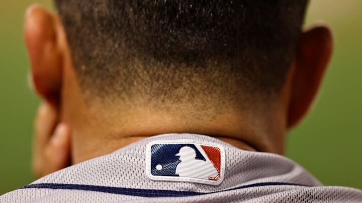
The 2024 MLB uniforms, which have been completely redesigned and re-engineered, earned a few early complaints about the refresh. What started as just a few player complaints has turned into an all-out meme war, with pictures circulating on social media of see-through pants and NSFW outcomes of purportedly thinner material.
For now, it's all laughs, but it is quickly turning into a serious problem for the league and its uniform partners.
The situation is dire enough that one player had to even purchase his own pants at a sporting goods chain store.
The complaints have bubbled up so far that the players' union is involved in mediating complaints and asking what can be changed before the 2024 regular season kicks off.
The uniforms are a joint venture between the league and two companies: Nike -- which handles design and development -- and Fanatics -- which handles production. They are now more lightweight and breathable, but some of those performance upgrades have led to changes in the longstanding and familiar characteristics of the jerseys, like heavy twill and stitched lettering and numbers.
Turns out, one of the obvious changes and issues, player name stitching, is in part due to something the league asked to be changed.
MLB asked for batterman logo to be lowered
By far one of the most incomprehensible changes to the jerseys is the placement of the batterman logo on the back of the uniforms. It used to be near the top of the neck of the jersey, but has been lowered a few inches. On some uniforms, there's a solid color stitched along the neckline, and the MLB logo always has sat above that line. Now, it sits below it, and makes the area of the jersey above that line of stitching look empty and purposeless.
Maybe it's just because we've become accustomed to it being in the same place for so long, but it just looks... wrong the way it is on the new uniforms.
The league, evidently, asked for that logo to be moved down so that the league's brand would gain as much exposure as possible. Possibly, players with longer hair were blocking the logo when it sat higher up on the jerseys.
Once that logo was moved down, it resulted in less available space for player names or anything else on the back of the jersey, and is one of the reasons the lettering is so much smaller and overall cheap-looking.
Here's what Eduardo Perez said on a recent episode of the Baseball Tonight Podcast about the placement of the batterman in particular.
"[The batterman] was brought down. And because it was brought down the names have been brought down, and because the names have been brought down the brand also has been brought down of the team. And that's a decision that really wasn't made by Nike or the players or the teams. It was made by Major League Baseball. And that's the part that we have to understand, look, you want to get that brand out there, you want to be able to showcase it, you want it a little bit bigger, these are the sacrifices that are having, that have to be made."
Here's a side-by-side look at the old and new:
this is a travesty pic.twitter.com/8BuqlPhB83
— zachleft (@zachleft) February 24, 2024
Clearly, massive differences in the sizing of the names. Looking at the batterman logo, you can see how far down it was shifted, and as a result, what was once large and clearly legible about player names has become small and tough to read.
The sizing of the lettering is one thing, but jerseys have been handed out to players that also featured off-center and amateurish-looking letter placement, too.
The blunders and changes with names is a low-key advantage for the few teams who wear name-less jerseys (the Yankees are the only team to wear nameless for home and away games, other teams like the Red Sox don't wear names for home games).
It's unclear what, if anything, will change about the jerseys in the immediate or near-term future. But if there's one thing fans would love to see brought back, it's the batterman higher and larger name lettering.
Good luck to all the tired souls that need to sort this out, fix errors, and get the league and fans bought in with whatever direction the new jerseys ultimately end up going in.
